Master Advanced Web Accessibility: Beyond Alt Text
While understanding alt text and semantic HTML is fundamental for web accessibility, many developers overlook crucial aspects that significantly impact user experience. This guide digs into advanced accessibility techniques, moving beyond the basics to ensure your websites are truly usable by everyone. You’ll learn to implement dynamic error handling, leverage ARIA attributes effectively, manage focus and tab order, ensure adequate touch target sizes, and utilize browser developer tools for robust accessibility testing.
1. Enhance Form Accessibility with ARIA Attributes
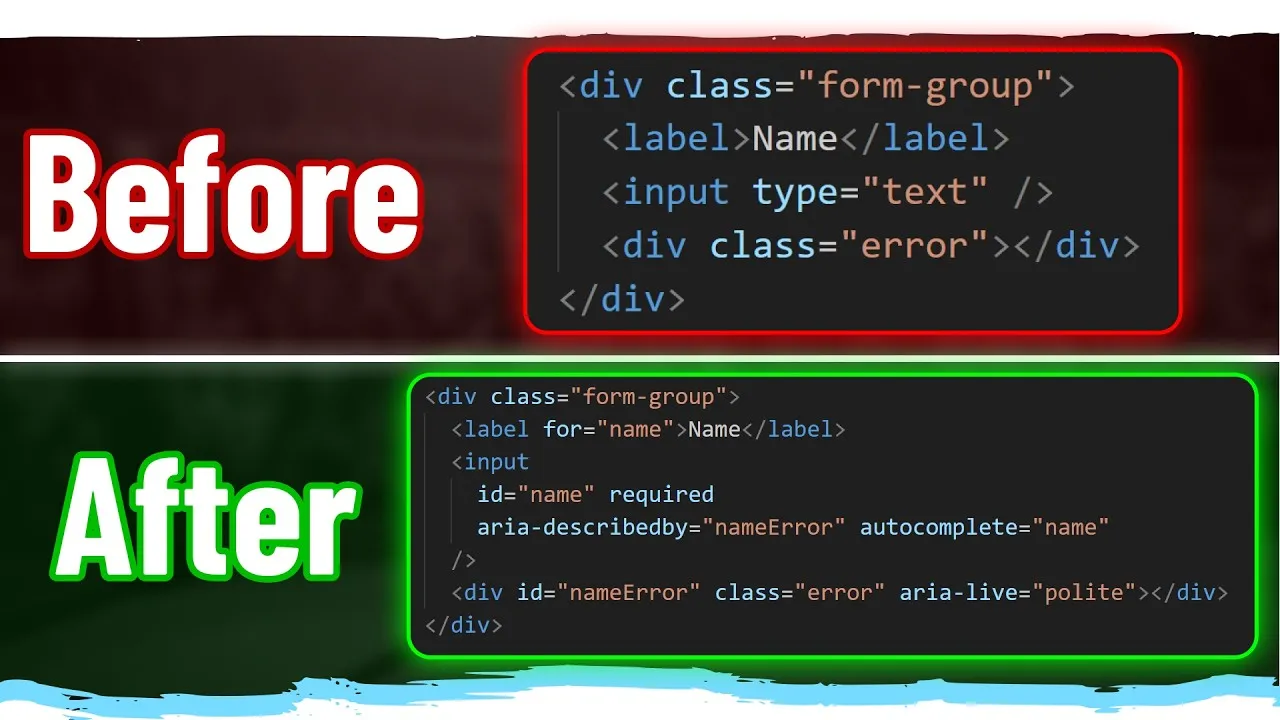
Basic form accessibility involves using for and id attributes. However, for dynamic error messages or contextual information, ARIA attributes are essential. If your form has validation errors that appear dynamically, screen readers won’t announce them unless explicitly told to.
- Associate Error Messages: Use the
aria-describedbyattribute on your input field. This attribute takes the ID of the element containing the error message. For example, if your error message is in adivwithid="name-error", addaria-describedby="name-error"to your input. - Announce Dynamic Changes: When content changes on the screen (like an error message appearing), use the
aria-liveattribute on the container of that content. Set it to"polite"to announce changes when the screen reader is idle, or"assertive"for immediate announcements (use sparingly). For most cases,"polite"is preferred.
Expert Note: Combine aria-live with aria-relevant (e.g., "additions", "removals", "text", or "all") and aria-atomic ("true" or "false") to fine-tune how screen readers announce changes. For instance, aria-atomic="true" will cause the entire content of the live region to be announced whenever any part of it changes, which can be useful for lists of notifications.
2. Implement Autocomplete for Enhanced User Experience
Improve usability, especially on mobile devices, by implementing the autocomplete attribute on form inputs. This allows browsers to pre-fill information, saving users time and effort.
- Identify applicable inputs (e.g., name, email, address).
- Add the
autocompleteattribute with a specific value. For example, useautocomplete="given-name"for a first name field,autocomplete="family-name"for a last name, orautocomplete="email"for an email address.
Tip: Refer to the HTML specification for a comprehensive list of autocomplete attribute values. Properly setting these can significantly improve the experience for users relying on password managers or browser autofill.
3. Manage Focus and Tab Order with the ‘inert’ Attribute
Ensure a logical and efficient tab order for keyboard navigation. Content that is hidden or off-screen should not be focusable, preventing users from tabbing through irrelevant or invisible elements.
- Hide Non-Visible Content: When elements like modals, drawers, or off-canvas menus are closed, apply the
inertattribute to them. This prevents users from tabbing into them and also makes them inaccessible to screen readers. - Reveal Content When Open: When the element becomes visible (e.g., when a modal opens), remove the
inertattribute (or set it tofalse) so it can be interacted with. - Prevent Interaction with Background Content: When a modal or similar overlay is active, apply
inertto the content behind it. This ensures users can only interact with the modal itself and not accidentally trigger elements on the page beneath.
Expert Note: The HTML element provides built-in handling for inertness, automatically making background content non-interactive when a dialog is open. Consider using it where appropriate.
4. Ensure Sufficient Touch Target Sizes
Interactive elements, especially on touch devices, must be large enough to be easily tapped without accidental clicks on adjacent elements.
- Minimum Size: Ensure all interactive elements (buttons, links, form controls) have a minimum size of 24×24 pixels.
- Recommended Size: For optimal usability, aim for 44×44 pixels, particularly for frequently used controls or on mobile interfaces.
- Adjust Styling: If an element’s visual size is small (like an ‘X’ button to close a modal), ensure its actual clickable area meets these minimums through padding or other styling methods.
5. Use Native HTML Elements Whenever Possible
Avoid recreating native HTML element behavior using `div`s, `span`s, and ARIA roles unless absolutely necessary. Native elements come with built-in accessibility features.
- Prefer Buttons: Use the native `
- Use Appropriate Elements: If you need a custom interactive component, consider if a native element (like “, “, `


Share this article