How to Judge F1 Team Websites: Design, Performance & More
Welcome, front-end enthusiasts! In this tutorial, we’re shifting gears from building to evaluating. We’ll be diving into the world of Formula 1 team websites to assess their design, performance, accessibility, and overall CSS implementation.
Think of it as a Formula 1 championship, but for websites, where each category earns points based on the official F1 point system (25 for first, down to 0 for last). By the end, we’ll crown a champion of F1 web design.
What You’ll Learn:
- How to critically assess website design based on visual appeal, brand fit, user experience, and ‘wow’ factor.
- Understand the importance of website performance and accessibility through practical examples.
- Evaluate CSS implementation and identify common design patterns and potential pitfalls.
- Compare and contrast the web presences of multiple Formula 1 teams.
Prerequisites:
- A modern web browser.
- Basic understanding of web concepts (design, performance, accessibility).
- An interest in Formula 1 (optional, but recommended for enjoyment!).
The Judging Criteria
We’ll be evaluating each website across four key categories, each acting as a round in our championship:
- Design: This is a subjective round focusing on visual appeal, how well the website represents the team’s brand, the overall user experience, and any ‘wow’ factor elements.
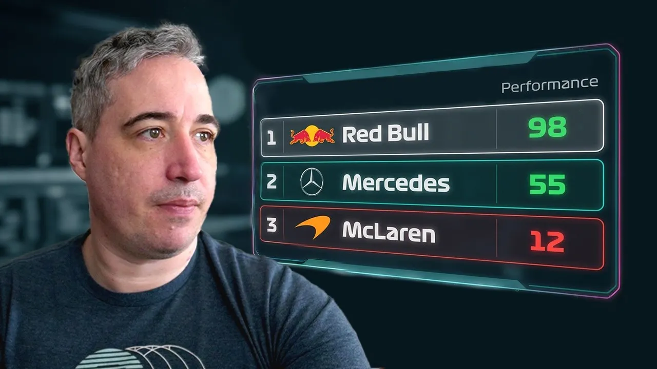
- Performance: We’ll look at how quickly pages load and how smoothly the site operates. (Note: This article focuses primarily on design and CSS observations from the transcript, with performance being a mentioned but less detailed category.)
- Accessibility: This round considers how usable the website is for everyone, including those with disabilities. (Note: While mentioned, detailed accessibility testing was not performed in the transcript’s examples.)
- CSS: This involves evaluating the quality, consistency, and effectiveness of the Cascading Style Sheets used to build the website.
- Red Bull Racing
- Visa Cash App RB (Racing Bulls)
- Alpine
- Ferrari
- Mercedes-AMG Petronas
- Williams Racing
- Aston Martin
- McLaren
- Haas F1 Team
- Stake F1 Team (Audi)
- (Team order may vary based on interpretation of ‘AlphaTauri’ section)
Round 1: Design & CSS Evaluation
1. McLaren
Observations: The McLaren website feels very template-like, lacking the expected ‘cool factor’ for a high-profile F1 team. While it incorporates the team’s signature papaya orange, it feels somewhat superficial. Animations are present but inconsistent and sometimes confusing.
Button design shows some shape, but this design element isn’t consistently applied elsewhere. Navigating to a driver page reveals minor animations, but overall, the design is considered boring and uninspired.
Verdict: Disappointing, feels like a generic template. Lacks a strong brand identity and ‘wow’ factor.
2. Red Bull Racing
Observations: Red Bull’s site immediately feels more aligned with the team’s brand, utilizing its signature colors effectively. Interactions, like hovering over elements, provide feedback, though some animations (like car images moving on hover) are noted as confusing. The presentation of car generations and driver details is more engaging than McLaren’s.
Some animations, while not always preferred, are integrated better. However, certain elements feel like they might be better suited for mobile and less optimized for desktop.
Expert Note: Consistency in design elements, such as image scaling across different car generations, could be improved.
Verdict: Stronger brand representation and more engaging than McLaren. Some design choices are questionable but overall a significant improvement.
3. Ferrari
Observations: The Ferrari website starts with a loading screen and a full-page carousel, which is not an ideal user experience. While featuring the car prominently is good, the carousel feels dated. Hover effects on driver images are problematic, with slow, strange growth animations and a lack of transition on hover-off.
The site also exhibits issues with tabbing navigation and has a peculiar full-screen PDF-like link for some content, which is a major drawback. Despite these issues, the visual appearance is rated better than McLaren’s, and some scroll-driven animations are noted.
Warning: Linking to external PDFs or non-interactive content deducts significant points. Ensure all content is integrated seamlessly.
Verdict: Visually appealing but plagued by poor UX choices, strange hover effects, and accessibility issues. Better than McLaren, but with significant flaws.
4. Mercedes-AMG Petronas
Observations: The Mercedes site incorporates team colors well and features a countdown to practice sessions. Some design elements, like the cut corners on buttons and hover effects, are similar to other teams. The hover effect on images transitions smoothly in both directions, which is a positive.
However, the site suffers from ‘scrolljacking,’ where scrolling the page jumps to different sections, which can be disorienting. Driver pages offer a narrative approach, which is a unique and positive feature. The mega-menu with different images for each driver is also a nice touch.
Expert Note: Scrolljacking can be a major accessibility and usability issue. While it can create a narrative, it often hinders user control.
Verdict: Better than Ferrari due to improved hover effects and driver pages, but scrolljacking is a significant negative. Ranks below Red Bull.
5. Aston Martin
Observations: Aston Martin’s website is expected to be flashy, but the initial impression is mixed. A prominent notification prompt is immediately off-putting. The cookie banner is oddly placed at the bottom with limited options.
The main content area is initially unclear, requiring scrolling to understand it’s primarily article-based. A ‘discover more’ link is hidden behind the cookie banner.
Navigation feels somewhat clunky, and the driver bio font size and spacing are problematic. While some animations are present, the overall homepage experience is confusing and the bio section is poorly presented.
Warning: Hiding key information or links behind intrusive banners or in unclear layouts significantly harms user experience.
Verdict: Confusing homepage, poor readability on driver pages, and intrusive elements place it below Ferrari.
6. Alpine
Observations: Alpine’s site features square-cut corners on elements and a less annoying carousel than some others. Hover effects are well-implemented, providing clear feedback. The site uses a lot of imagery, which looks cool but can make navigation less intuitive for signing up for things.
Driver pages have improved readability with better font size and spacing compared to Aston Martin. Carousels are used for images, which is acceptable. The overall design feels somewhat template-like but executed better than some others.
Verdict: A well-executed ‘template’ site. Better than Aston Martin and Ferrari due to fewer critical issues, but not as strong as Red Bull.
7. Haas F1 Team
Observations: The Haas website is described as worse than McLaren’s and appears to be a generic news website template. It features a repetitive carousel and an unclickable image element.
The driver pages are functional but feel uninspired and similar to McLaren’s. The site suffers from slow image loading (a 1.7MB image impacting performance) and a generally busy, overwhelming design.
Warning: Overuse of large image files severely impacts performance. Optimize all assets.
Verdict: Considered the worst among the initial group, feeling generic and poorly optimized.
8. Visa Cash App RB (Racing Bulls)
Observations: This site presents a clean design with an offset text hero area and a textured background. Alignment issues are noted between elements. Hover effects are correctly implemented.
Card-based layouts for drivers are clear and less overwhelming than some other approaches. However, scroll-driven animations are used, which can be problematic for users with vestibular disorders.
While the driver cards are good, they aren’t directly clickable for more info. The overall presentation is clean and modern, with some interesting animations.
Expert Note: Be mindful of users with vestibular disorders when implementing scroll-driven animations. Ensure reduced motion preferences are respected.
Verdict: Ranks highly due to clean design and correct hover effects. Some animation concerns and clickability issues prevent it from taking the top spot, placed second.
9. Williams Racing
Observations: Williams uses a top carousel that auto-plays, which is considered annoying. The site features an ad (though it didn’t load, its presence is noted as a negative). Despite feeling template-like, the design is considered well-adapted to the brand.
Navigation to driver information is somewhat hidden. Driver pages are decent, feeling like a better version of McLaren’s. The site is ranked as the best among the ‘template’ sites evaluated.
Warning: Ads on official team websites are generally unacceptable. Avoid them.
Verdict: Best of the template-like sites, better than Aston Martin due to fewer critical issues. Ranks above Aston Martin.
10. Stake F1 Team (Sauber) – Audi
Observations: The Audi (now Stake F1 Team) website opens with a prominent cookie banner that fades the site and a looping video that struggles to load. The primary focus seems to be on merchandise, which is questioned as the main purpose of the site. Excessive video content makes the site feel heavy and potentially overwhelming.
While a hero section with the car is presented well, it should arguably be the landing point, not buried under merchandise links. The design is criticized for being too video-heavy and lacking a clear focus beyond shopping.
Verdict: Overly focused on merchandise, heavy on video content, and a poor initial user experience. Falls to the lower end of the rankings.
11. AlphaTauri (now Visa Cash App RB)
Observations: (Note: The transcript mentions AlphaTauri, but the context and later teams suggest this might be referring to the team now known as Visa Cash App RB, or a separate evaluation. Based on the description, this section appears to be a placeholder or a slightly confused recap.) The description mentions a carousel and buttons with a hover effect, similar to other teams. It notes that the hover effect is implemented correctly, with better easing than Ferrari’s attempt.
The site uses many images, potentially making it better suited for mobile. The design is described as ‘templatey but done better.’ It’s considered to be above Aston Martin and potentially Ferrari.
Verdict: A solid, well-executed template design, potentially ranking above Aston Martin and Ferrari due to fewer significant flaws.
Final Standings (Design & CSS Focus)
This concludes our initial design and CSS evaluation. The next steps in a full championship would involve diving deeper into performance and accessibility metrics.
Source: F1 Website Championship (YouTube)