Learn to Create Engaging Animations with Custom Linear Timing Functions
In modern web development, animations are crucial for creating engaging user experiences. While CSS offers built-in timing functions like `ease-in`, `ease-out`, and `ease-in-out`, these can sometimes feel too generic.
For a more refined and professional touch, custom linear timing functions can significantly improve the feel of your animations. This guide will walk you through how to leverage tools to generate and implement these advanced timing functions, adding a subtle yet impactful enhancement to your web projects.
What You Will Learn
- How to find and generate custom linear timing functions.
- How to implement these custom functions in your CSS.
- How to add fallbacks for broader browser compatibility.
- Tips for improving animation weight and satisfaction.
Prerequisites
- Basic understanding of CSS animations.
- Familiarity with CSS custom properties (variables).
Step 1: Discover and Generate Custom Timing Functions
The key to creating more sophisticated animations lies in using timing functions that go beyond the standard options. While writing complex timing functions manually is possible, it’s often tedious and error-prone. Fortunately, online tools can generate these for you.
A recommended resource is easingwizard.com. This website provides a visual interface to explore and generate various easing functions, including custom linear ones.
- Navigate to easingwizard.com.
- Explore the different easing function categories. For this tutorial, we’ll focus on generating a ‘bounce’ effect, but you can experiment with others like ‘sharp’ or any custom curve you desire.
- Once you’ve selected or created your desired timing function, the tool will provide the corresponding CSS cubic-bezier() value.
- Look for an option to copy this generated timing function to your clipboard. Many tools will present it in a format ready for CSS, typically starting with `cubic-bezier(…)` or a similar syntax.
Step 2: Implement the Custom Timing Function in CSS
With your custom timing function generated and copied, the next step is to integrate it into your CSS code. This involves replacing the existing timing function for your animation properties.
- Identify the CSS rule where your animation’s timing function is defined. This is often within the `animation-timing-function` property or within a `transition` property.
Example: If you had a basic transition like this:
.element { transition: transform 0.5s ease-in-out; } - Replace the existing timing function (e.g., `ease-in-out`) with the long string you copied from easingwizard.com. The generated function will typically be a `cubic-bezier()` value.
Example: Replacing `ease-in-out` with a custom bounce function:
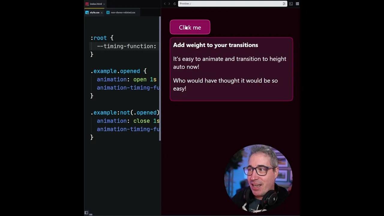
.element { /* Assuming the copied value was cubic-bezier(0.68, -0.55, 0.27, 1.55) */ transition: transform 0.5s cubic-bezier(0.68, -0.55, 0.27, 1.55); } - Apply this to all relevant animation or transition properties where you want this enhanced timing. The transcript mentions applying it to both ‘open’ and ‘close’ states, suggesting it might be used for expanding/collapsing elements or similar UI patterns.
Adjusting Animation Duration
After implementing the custom timing function, you might find that the default animation duration no longer feels quite right. Custom easing functions, especially those with overshoot or bounce effects, can alter the perceived speed and impact.
- Experiment with the duration value (e.g., `0.5s` in the example above). The transcript suggests adjusting it to `.7s` for a more satisfying feel.
- Modify the duration until the animation feels appropriately weighted and smooth.
- Expert Note: For better maintainability, consider using CSS custom properties (variables) for your animation durations. This allows you to easily adjust timing across multiple elements from a single definition.
Step 3: Add Fallbacks for Browser Compatibility
While browser support for `cubic-bezier()` timing functions is generally good, it’s always wise to provide a fallback for older browsers or specific environments that might not fully support complex custom easing.
CSS custom properties offer an elegant solution for this:
- Define a default, widely supported timing function (like `ease-in-out` or `linear`) as a fallback using a custom property.
- Define your preferred custom timing function using another custom property.
- In your animation or transition rule, use the custom property that holds your preferred timing function. If that property isn’t supported or doesn’t resolve correctly, the browser will fall back to a more basic setting if you structure it carefully, or you can explicitly set a fallback. A common pattern is to set the custom property on a parent or globally, and then use it. If the specific custom timing function syntax isn’t supported, the browser might ignore it, so having a direct fallback is safer.
A more robust fallback strategy using custom properties:
- Define a custom property for the fallback timing function globally or on a parent element:
:root { --fallback-timing: ease-in-out; } - Define your custom timing function, again using a custom property:
:root { --custom-bounce-timing: cubic-bezier(0.68, -0.55, 0.27, 1.55); } - Apply the custom property in your transition or animation. To ensure a fallback, you can set the property directly and then override it with the custom one, or use a method that prioritizes the custom one if supported.
Method 1: Direct Application with Fallback
.element {
 /* This provides a direct fallback */
 animation-timing-function: var(--fallback-timing);
 /* Override with custom if supported */
 animation-timing-function: var(--custom-bounce-timing);

 /* For transitions */
 transition-timing-function: var(--fallback-timing);
 transition-timing-function: var(--custom-bounce-timing);
}
Method 2: Using a Variable that resolves to the custom one
:root {
 --animation-timing: var(--custom-bounce-timing, var(--fallback-timing));
}

.element {
 animation-timing-function: var(--animation-timing);
 transition-timing-function: var(--animation-timing);
}
In Method 2, if `–custom-bounce-timing` is not defined or supported, the browser will attempt to use `–fallback-timing`.
Tip: Consider Tailwind CSS Options
If you are using the Tailwind CSS framework, it might offer utility classes or configuration options for custom `cubic-bezier` values, which can streamline the implementation process within a Tailwind-based project.
Conclusion
By incorporating custom linear timing functions, you can elevate the quality and user satisfaction of your web animations. Tools like easingwizard.com make the generation process accessible, while CSS custom properties provide a robust way to manage and implement these enhancements, ensuring both modern appeal and backward compatibility. Experiment with different easing curves to find the perfect feel for your specific design needs.
Source: linear() is so good (YouTube)