Learn to Anchor Elements with CSS for Dynamic Web Designs
This guide will walk you through advanced use cases of CSS anchor positioning, moving beyond basic tooltips and menus. You’ll learn how to tether elements to siblings, manage dynamic layouts, and create intricate visual connections between elements, even when they aren’t directly related in the DOM.
Prerequisites
- Basic understanding of HTML and CSS.
- Familiarity with CSS positioning concepts (
position: absolute,position: relative). - A modern web browser that supports CSS anchor positioning.
Use Case 1: Tying an Element to a Sibling
Traditionally, positioning an element relative to a sibling, especially when the sibling’s dimensions change, can be challenging. Anchor positioning offers a robust solution.
Identify the Anchor and the Anchored Element
In this scenario, we have a product card with an image and a badge. We want to position the badge to the bottom-right corner of the image, even if the image size changes. The image will be our anchor, and the badge will be the element we position.
Assign an Anchor Name to the Anchor Element
Select the element you want to use as an anchor (the image in this case) and assign it a unique anchor name using the
anchor-nameCSS property. This name must start with two hyphens, similar to CSS custom properties..product-image { anchor-name: --product-image; }Position the Anchored Element Using Anchor Positioning
On the element you want to position (the badge), set its
positiontoanchor(). Then, use theanchor()function to specify which part of the anchor element you want to align with which part of the anchored element. For example, to place the badge at the bottom-right of the image:.badge { position: anchor(); bottom: anchor(--product-image bottom); right: anchor(--product-image right); }This tells the browser to align the bottom edge of the badge with the bottom edge of the element named
--product-image, and the right edge of the badge with the right edge of the same anchor.Adjusting Position with Calculations
You can fine-tune the positioning using CSS
calc(). For instance, to offset the badge slightly from the bottom-right corner:.badge { position: anchor(); bottom: calc(anchor(--product-image bottom) + 8px); right: calc(anchor(--product-image right) + 8px); }Note: The video mentions that offsets like
+ 8pxor- 8pxare resolved by the browser into computed pixel values.Handling Scoping with
anchor-scopeA potential issue arises when multiple elements share the same anchor name. By default, the last one encountered wins.
To prevent this, use the
anchor-scopeproperty. This property is typically applied to a common ancestor or the element itself to limit the scope of the anchor name..product { anchor-scope: --product-image; }This ensures that the
--product-imageanchor name is only recognized within the context of the.productelement, preventing conflicts if other elements on the page also use the same anchor name.
Expert Note: Avoiding Positioning Conflicts
When using anchor positioning, be mindful of existing positioning contexts. If an ancestor element has position: relative, it might interfere with how anchor positioning works.
In some cases, you might need to adjust or remove these properties from ancestors to ensure anchor positioning functions as expected. The anchor-scope property is crucial for managing these scenarios gracefully.
Use Case 2: Creating Visual Connections (Threads)
Anchor positioning is excellent for creating visual links between elements, such as connecting chat replies to their parent comments. This is often achieved using pseudo-elements.
Structure the HTML
Set up your HTML with a clear parent-child or related structure. For example, a main comment with a list of replies, where each reply might have its own nested replies.
<div class="thread">
 <div class="comment">
 <!-- Comment content -->
 <ul class="replies">
 <li class="reply">
 <!-- Reply content -->
 </li>
 <li class="reply">
 <!-- Reply content -->
 </li>
 </ul>
 </div>
</div>
Create a Pseudo-Element for the Connection Line
Use a pseudo-element (
::beforeor::after) on the child elements (e.g.,.reply) to act as the connecting line. Give it basic styling like a width, height, and background color initially, so you can see it..reply::after { content: ''; display: block; width: 100px; /* Initial width, will be adjusted */ height: 1px; /* Initial height, will be adjusted */ background-color: white; }Assign Anchor Names to Relevant Elements
Assign anchor names to the elements that will serve as connection points. In a chat thread, you’ll likely want to anchor to the comment (where the line originates) and potentially to the reply itself (where the line terminates or originates from).
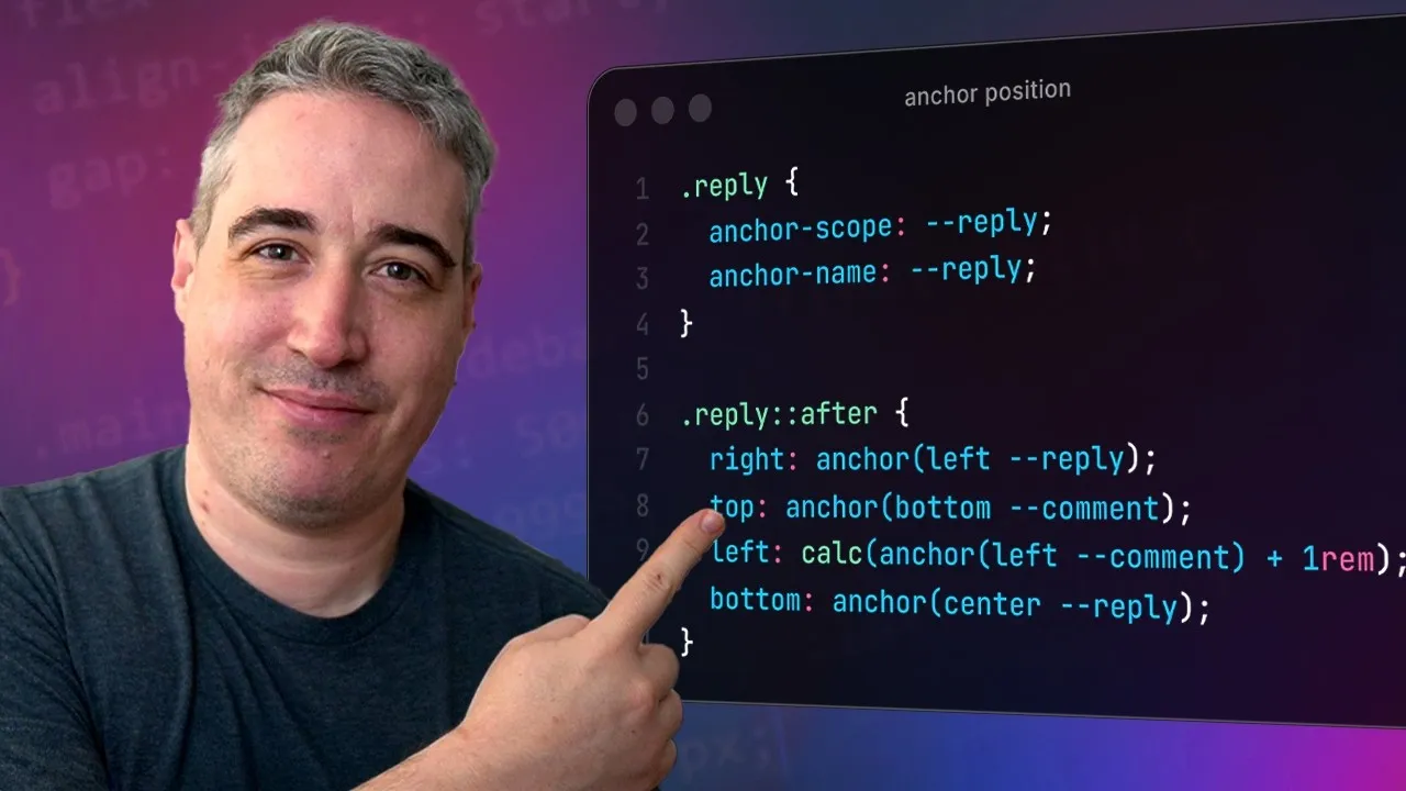
.comment {
 anchor-name: --comment-anchor;
}

.reply {
 anchor-name: --reply-anchor;
}
Position the Pseudo-Element Using Anchor Positioning
Use
position: anchor()on the pseudo-element. Then, define its position by anchoring specific edges or points of the pseudo-element to corresponding points on the anchor elements. For example, to draw a line from the bottom of a comment to the center of a reply:.reply::after { position: anchor(); /* Anchor the top of the line to the bottom of the comment */ top: anchor(--comment-anchor bottom); /* Anchor the center of the line to the center of the reply */ left: anchor(--reply-anchor center); /* Adjust height and remove initial width */ height: auto; /* Let content define height, or set a fixed value */ width: 1px; /* Make it a vertical line */ background-color: white; }If you want a horizontal line from the comment to the reply, you would adjust accordingly:
.reply::after {
 position: anchor();
 /* Anchor the left of the line to the right of the comment */
 left: anchor(--comment-anchor right);
 /* Anchor the center of the line to the center of the reply */
 top: anchor(--reply-anchor center);
 width: auto; /* Let content define width */
 height: 1px; /* Make it a horizontal line */
 background-color: white;
}
Apply
anchor-scopefor Individual ConnectionsSimilar to the first use case, if multiple replies might have the same anchor names, or if you need to ensure a reply line only connects to its immediate parent comment, use
anchor-scope. Apply it to the element that defines the boundary for the anchor names..reply { anchor-scope: --reply-anchor; } .comment { anchor-scope: --comment-anchor; }This ensures that each reply’s pseudo-element correctly anchors to its specific parent comment and reply, rather than a globally defined anchor of the same name.
Refine Styling
Once the positioning is correct, refine the styling. Remove the background color and use borders for a cleaner look. Adjust border-radius for curved connections and use
calc()for precise spacing and alignment..reply::after { /* ... Positioning properties ... */ background-color: transparent; border-right: 3px solid white; /* Example */ border-radius: 0 0 0 12px; /* Example for curved connection */ width: calc(anchor(--reply-anchor left) - anchor(--comment-anchor right)); /* Adjust width dynamically */ }
Expert Note: Dynamic Lines and Animations
Anchor positioning, especially when combined with pseudo-elements, opens up possibilities for dynamic lines that adapt to content changes. You can even animate these connections by animating properties like width or height on the pseudo-element, creating smooth transitions between different anchor points.
Conclusion
CSS anchor positioning is a powerful tool for creating sophisticated and dynamic layouts. By mastering techniques like tethering to siblings and creating visual connections, you can build more robust and responsive web interfaces that adapt seamlessly to varying content and screen sizes.
Source: A couple of great anchor positioning use cases (YouTube)