Mastering Container Queries Beyond Basic Usage
Container queries are a powerful tool for creating responsive web designs, but many developers are still using them in a way that mirrors traditional media queries. This article will guide you through a more advanced and flexible approach to container queries, enabling you to build smarter, more intrinsic layouts.
Understanding the Evolution from Media Queries
For years, media queries have been the cornerstone of responsive web design. They allow us to adapt our layouts based on the characteristics of the viewport, such as its width.
This has trained us to think in terms of specific breakpoints defined by the overall screen size. Ethan Marott’s seminal work in 2010 on responsive web design highlighted the importance of this approach, which has shaped the modern web.
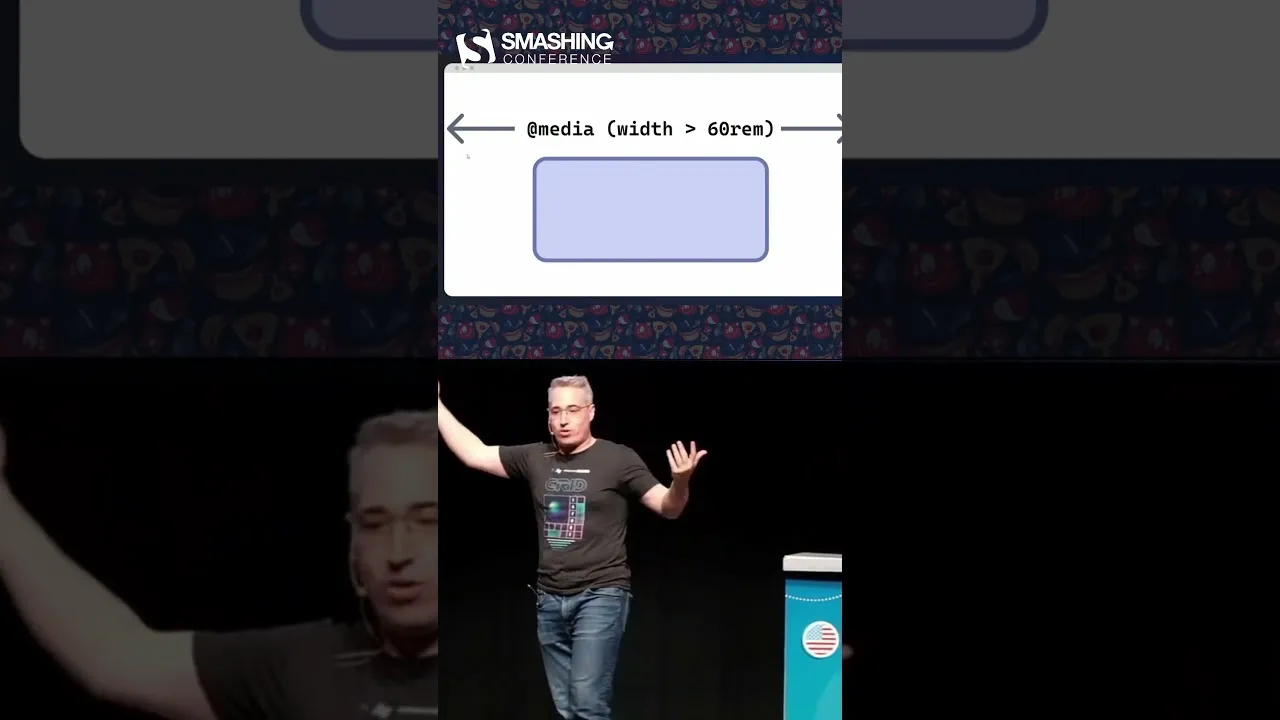
The syntax of container queries might appear similar to media queries at first glance. Both involve setting conditions based on size. However, the fundamental difference lies in what they observe.
Media queries assess the viewport, checking if its width exceeds or falls below a specified value. Container queries, on the other hand, focus on the dimensions of their parent container. This distinction is crucial for unlocking the full potential of container queries.
The Misconception and the Revelation
The common practice has been to apply container queries in a manner analogous to media queries – reacting to the container’s size as if it were a viewport. While this approach yields responsive results, it doesn’t fully leverage the capabilities of container queries. The true power of container queries lies in their ability to create more sophisticated and context-aware layouts, moving beyond simple viewport-based adjustments.
Recent discoveries reveal that container queries can offer much more. They enable us to build layouts that are intrinsically designed, meaning their structure and appearance are determined by their content and available space, rather than solely by external viewport constraints. This shift allows for more dynamic and adaptable components that can seamlessly integrate into various layouts.
Leveraging Container Queries for Intrinsic Design
Intrinsic design principles suggest that components should be designed to adapt naturally to their surroundings. Container queries are the perfect tool for this. Instead of forcing a component to fit a predefined layout, we can use container queries to allow the component to dictate its own presentation based on the space it actually occupies.
This means that a component can have multiple states or styles that are activated not by a global viewport change, but by the specific dimensions of its immediate parent container. This leads to more robust and reusable components that don’t require constant media query adjustments for every possible screen size.
How to Implement Advanced Container Queries
The core idea is to define styles that respond to the size of a specific element (the container) rather than the entire browser window (the viewport).
Define a Container Element
First, identify the HTML element that will serve as your container. This could be a
div, asection, or any other block-level element that wraps the component you want to make responsive.Set the Container Type
In your CSS, you need to declare the element as a query container. This is done using the
container-typeproperty. Common values includeinline-size(which queries the horizontal size) orsize(which queries both horizontal and vertical size).Example:
.my-container {
 container-type: inline-size;
}
Apply Container Queries
Now, you can write your container queries using the
@containerrule. These queries will target styles based on the dimensions of the element declared as a container.Example:
.my-component {
 /* Default styles */
 width: 100%;
 background-color: lightblue;
}

@container (min-width: 400px) {
 .my-component {
 background-color: lightgreen;
 /* Adjust styles for larger containers */
 }
}

@container (min-width: 600px) {
 .my-component {
 background-color: lightcoral;
 /* Further adjustments for even larger containers */
 }
}
Structure Your HTML
Ensure your HTML is structured so that the component you want to be responsive is a direct or indirect child of the element you’ve designated as a container. The container query will then apply styles to this child component based on the container’s size.
Example:
<div class="my-container">
 <div class="my-component">
 Content that adapts...
 </div>
</div>
Benefits of Advanced Container Query Usage
- Intrinsic Responsiveness: Components adapt to their specific space, not just the viewport.
- Component Reusability: Create highly reusable components that work well in diverse layouts without modification.
- Smarter Layouts: Enables more complex and context-aware design patterns.
- Reduced CSS Complexity: Can lead to less reliance on overly specific media queries.
Expert Note:
While inline-size is commonly used for width-based queries, remember that container-type: size; allows you to query both width and height, opening up even more possibilities for truly adaptive components.
Conclusion
By shifting your understanding of container queries from a media query-like pattern to a tool for intrinsic design, you can unlock a new level of flexibility and power in your web development. Embrace container queries to build smarter, more adaptable, and reusable components that truly respond to their environment.
Source: We've been using container queries wrong (YouTube)