How to Build Responsive Layouts with Container Queries and Calc
This article shows you how to create layouts that automatically adjust. You’ll learn to use container queries with the CSS `calc()` function. This makes your designs smarter. They will adapt to the container’s size and font. This is a powerful way to build flexible web pages.
What You Will Learn
You will learn how to use CSS container queries. You will also learn to use the `calc()` function within them. We will compare container queries to older methods. You will see how to make layouts adapt to font sizes. This will help you build more dynamic and user-friendly websites.
Prerequisites
- Basic understanding of HTML and CSS.
- Familiarity with CSS units like `px` and `ch`.
Understanding Container Queries vs. Media Queries
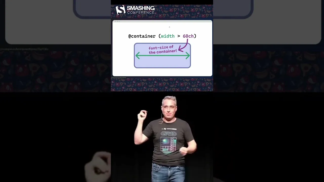
Before we start, let’s look at the difference. Media queries check the browser window size. For example, `@media (min-width: 60ch)` checks the browser width. The `ch` unit is about character width. It’s roughly the width of the ‘0’ character. This width depends on the font size. The browser sets this font size. So, `60ch` is like a fixed number. It’s similar to using `600px`. It doesn’t change unless the user changes their browser settings. Media queries are not always the best tool. They don’t know about the content’s container.
Container queries are different. They check the size of a specific element, or container. For example, you can set a rule for a container that is `30ch` wide. This `30ch` comes from the container itself. This is a small change but very important. It means your layout reacts to its own space. Not just the whole browser window.
Using Container Queries with `calc()`
Now, let’s see how to use container queries with `calc()`. This lets you do more complex calculations. You can combine different units or values. This makes your layouts even more flexible.
Step 1: Set Up Your Container
First, you need an HTML element to act as your container. You will apply styles to this container. Let’s say you have a `div` with a class of `my-container`. You’ll also want to see the container’s boundaries. Use a border or outline for this. For example, `outline: 2px solid red;` helps visualize it.
Step 2: Define Container Query Styles
Next, you write your container query. This uses the `@container` rule. You specify the container size you want to react to. You can use `min-width`, `max-width`, or `width` conditions. Inside the query, you write your CSS rules. These rules apply only when the container meets the condition.
For instance, imagine you want to create columns. You want three columns when the container is wide enough. You can use `30ch` as a guide for line length. This is useful for designers. Designers often know ideal line lengths. They want text to be easy to read. Too long or too short lines can be bad. Using `30ch` ensures a good line length for each column.
Here’s how you might write it:
- Apply a container query to your element.
- Use a condition like `(min-width: 30ch)`.
- Inside the query, style the content to create columns. For example, `display: grid; grid-template-columns: repeat(3, 1fr);`
Step 3: Use `calc()` for Dynamic Sizing
The real power comes when you use `calc()` inside the container query. You can calculate widths, gaps, or other values. This allows for very precise control.
For example, you might want columns with a specific gap. The gap should also adjust based on the container. You can use `calc()` to figure this out. Maybe you have padding and gaps to consider. You can subtract these from the total container width. This ensures your columns fit perfectly.
Let’s say you want three columns. You also want a gap between them. You can use `calc()` like this:
- Define the container query: `@container (min-width: 30ch) { … }`
- Inside the query, set the columns using `calc()`: `grid-template-columns: calc( (100% – 2 * var(–gap)) / 3 );`
- Make sure to define `–gap` elsewhere in your CSS.
This example calculates the width for each of the three columns. It subtracts the space for two gaps. Then it divides the remaining space by three. This creates equal columns with consistent spacing.
Smart Layouts That Adapt to Font Size
One amazing benefit is how this interacts with font sizes. Font sizes are usually inherited. They flow from the `html` or `body` element down. If you change the font size on the `body`, it affects everything. Your container queries will also adapt.
This means your breakpoints change with the font size. Everything scales up proportionally. You get a layout that is aware of the font size. This creates a smarter, more fluid design. It’s especially useful when combined with fluid typography techniques like `clamp()`.
Imagine a user increases their browser’s default font size. Your columns will adjust. The text will remain readable. The layout won’t break. It’s a truly responsive experience.
Expert Note on `ch` Unit
The `ch` unit is based on the width of the ‘0’ character. It’s a good unit for text-heavy layouts. It helps maintain readable line lengths. However, remember it can vary slightly between fonts. For precise pixel-perfect control, you might still need to test and adjust.
Conclusion
Using container queries with `calc()` offers a powerful way to build responsive websites. You can create layouts that adapt not just to screen size, but also to their own content and font settings. This leads to more flexible, accessible, and user-friendly designs. Start experimenting with these techniques today!
Source: This blew my mind (YouTube)