Overview
Animations can make websites feel alive and engaging. But sometimes, they can be tricky to get right. This guide will show you simple ways to improve your CSS animations. You’ll learn how to make them cleaner, avoid common mistakes, and combine different animation effects effectively. We’ll focus on practical tips to make your animations work smoothly every time.
Prerequisites
- Basic understanding of HTML and CSS.
- Familiarity with CSS keyframes and animations.
Step 1: Simplify Your Keyframes
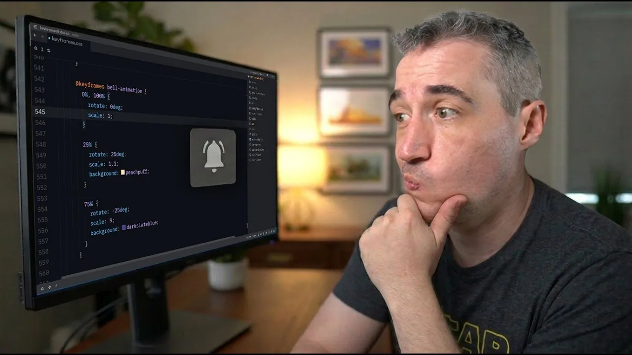
Often, CSS animations use many keyframes to define every step. This can make your code harder to read and change. A good tip is to combine keyframes that have the same values. You can do this by separating the percentages with a comma.
For example, if you have keyframes at 25% and 75% that do the same thing, you can write them as 25%, 75%. This means both points in the animation will use the same style. Then, you can remove the duplicated keyframe, making your code shorter and easier to manage.
Example: Combining Keyframes
Imagine an animation that moves an element back and forth. You might have keyframes like this:
@keyframes move {
  0% { transform: translateX(0); }
  25% { transform: translateX(50px); }
  75% { transform: translateX(50px); }
  100% { transform: translateX(0); }
}
You can simplify this by combining the 25% and 75% keyframes:
@keyframes move {
  0% { transform: translateX(0); }
  25%, 75% { transform: translateX(50px); }
  100% { transform: translateX(0); }
}
This results in the exact same animation but with less code.
Step 2: Avoid Unnecessary Start and End Keyframes
Sometimes, you don’t need a 0% (start) or 100% (end) keyframe. If your animation starts from the element’s default state, you can often leave out the 0% keyframe. The animation will simply start from whatever the element’s current style is.
Similarly, if the animation ends in a state that matches the element’s default or a previous keyframe, you might not need a 100% keyframe. This can prevent unexpected behavior, especially when an animation is triggered by an event like hovering.
Why this helps:
When an element already has a style applied (like a rotation from a class), starting an animation at 0% might force it to reset to that 0% value before it can begin its intended movement. This can cause a glitchy or jarring effect. By removing the 0% keyframe, the animation can start from its current state and transition smoothly into the defined animation steps.
Example: Glitchy Animation
Consider a button that’s supposed to lean left. If the animation starts with a 0% keyframe that resets its rotation, it might look wrong. But if you remove that 0% keyframe, the animation starts from the button’s pre-existing lean, making the movement smoother.
Step 3: Use `transform` for Combined Effects
Modern CSS allows you to combine multiple transformation properties like `rotate`, `scale`, and `translate` within a single `transform` declaration. This is much better than trying to animate them separately or using older methods.
When you use `transform`, you can layer these effects. For example, you can rotate an element and then move it, or scale it and then rotate it. They don’t conflict with each other; they just stack on top.
How to combine them:
You define the `transform` property once and list all the functions you need inside it, separated by spaces. The order matters, as it determines the order in which the transformations are applied.
/* Example: Rotating and then translating */
.my-element {
  animation: moveAndRotate 2s ease-in-out forwards;
}

@keyframes moveAndRotate {
  from { transform: rotate(0deg) translateX(0); }
  to { transform: rotate(360deg) translateX(50px); }
}
This approach keeps your animations predictable and prevents conflicts. It ensures that transformations are applied relative to the element’s current state, leading to more consistent results across different elements.
Conclusion
By simplifying your keyframes, removing unnecessary start and end points, and using the `transform` property effectively, you can create cleaner, more reliable CSS animations. These techniques help avoid common issues like glitchy movements and make your animation code easier to maintain. Experiment with these tips to make your web designs more dynamic and visually appealing.
Source: Simplifying CSS animations (YouTube)