How to Code a Weather UI in 10 Minutes: A Fast-Paced Challenge
This tutorial shows you how to quickly build a weather user interface (UI) by racing against a 10-minute timer. You’ll learn how to use CSS custom properties and flexbox to match a given design, focusing on speed and efficiency. It’s a fun challenge inspired by coding competitions.
What You’ll Learn
- How to set up and style basic UI elements like backgrounds and borders.
- Using CSS custom properties (variables) for consistent theming.
- Applying flexbox for layout and alignment.
- Quickly adjusting font sizes, weights, and colors.
- Strategies for working under a strict time limit.
Prerequisites
- Basic understanding of HTML and CSS.
- A code editor and a web browser.
- Familiarity with browser developer tools can be helpful.
The Challenge Begins
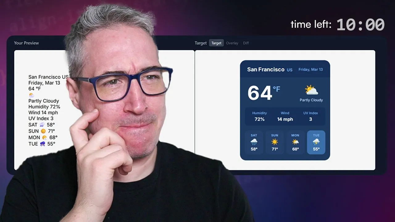
This challenge is about matching a target UI design within a strict 10-minute time limit. A timer starts as soon as you begin coding. You can try to beat the timer yourself or code along with the steps shown here. The provided HTML is read-only, so all changes will be made using CSS.
Step 1: Planning and Setup (2 Minutes)
Before diving into coding, take a couple of minutes to plan. Look at the target UI and identify key elements and styles. Note down any custom properties (variables) that will be needed for colors, borders, and spacing. This pre-coding planning can save valuable time later.
Tip:
It’s helpful to temporarily increase the font size in your developer tools for better visibility while coding, especially for recordings or if you have visual preferences.
Step 2: Basic Styling and Variables
Start by applying the main background color and border radius to the primary container, often a `div` with a class like `bg-card`. Use your planned custom properties for these styles to ensure consistency. For example, set the background using `var(–bg-card)` and the border radius using `var(–border-radius-card)`.
Next, tackle the header. Give it a background color using `var(–bg-header)`. You might need to define a padding variable, like `–padding-one-rem`, since consistent padding is often required across multiple elements. Apply this padding variable and consider using `overflow-clip` if needed to manage content within the element’s bounds.
Expert Note:
Creating a padding variable early on can save time if many elements require similar spacing. You can adjust this variable later if needed.
Step 3: Styling Text Elements
Begin styling the text elements, starting with the body’s default text color. Apply custom properties for colors like `color-city`, `color-condition`, and `color-date`. You might set a default text color, such as white, for elements that require it.
Style the header’s text. Use `display: flex` and a `gap` for spacing between elements if necessary. Adjust font weights and sizes for specific elements like the location, city, and country. For instance, the country might have a smaller font size (e.g., 12 pixels) and a specific color (`var(–color-country)`).
Apply similar styling to date labels, ensuring they match the design’s appearance. You may need to experiment with different font sizes (e.g., 10px, 12px, 14px) to get the look right. The goal is to quickly apply styles based on the visual reference.
Step 4: Layout and Spacing
Set a width for the main container if it helps in visualizing the layout. This can provide a better sense of scale. Adjust the padding if it looks too small or too large, aiming for a closer match to the target UI. At this stage, don’t worry too much about perfect alignment; focus on getting the basic structure and spacing correct.
Move on to the main weather display section. Use `display: flex` for layout. Style the temperature value with a large font size (e.g., 70 pixels) and a bold font weight (e.g., 700). To align the temperature unit (like ‘F’ for Fahrenheit) with the number, apply `display: flex` to the temperature block. Setting `line-height: 1` can help control vertical spacing.
Tip:
If elements appear too close or too far apart, adjust the padding and margins. For the main weather section, `justify-content: space-between` can be useful for distributing items.
Step 5: Styling Conditions and Stats
Address the condition block and statistics. You might use `display: flex` or `display: grid` for these sections. For the stats, `display: grid` with `grid-auto-flow: column` can create a nice horizontal layout. Ensure each stat is centered using `text-align: center`.
Add spacing between individual stats using `margin-inline`. Apply padding and a background color using a custom property like `var(–bg-stats)` to the stats container. Style the stat labels with appropriate font sizes (e.g., 10px or 12px) and colors.
Add a `border-radius` to the stats elements using a relevant variable, such as `var(–border-stat)`. This adds a polished look to the individual stat cards or elements.
Step 6: Final Touches and Refinements
Work on the forecast section. If forecast items are individual elements, consider using `display: grid` or `display: flex` to stack them vertically and center their text. Add a small `gap` or `margin` between forecast items for visual separation.
Style the forecast text with appropriate font sizes and weights. Apply the correct colors using custom properties. Pay attention to the details, like the size and color of icons within the condition block. Adjust font sizes for icons (e.g., 40 pixels) and text (e.g., 14 pixels) to match the design.
Warning:
Be mindful that emoji rendering can differ between operating systems (like Windows vs. macOS), which might affect the exact match of icons. This is a common challenge in UI development.
Step 7: Review and Adjust
With the timer nearing zero, quickly review the UI. Check for any major alignment issues or incorrect styles. Make small adjustments to font sizes, padding, or gaps as needed. The goal is to get as close as possible to the target design within the time limit.
Don’t get bogged down trying to achieve pixel-perfect accuracy. Focus on the overall structure and the most prominent visual elements. The challenge emphasizes speed and making progress, rather than absolute perfection. Knowing the exact font sizes beforehand would significantly speed up this process.
Conclusion
Completing this challenge in 10 minutes requires quick thinking and efficient coding. The final result might not be pixel-perfect, but it demonstrates how much can be achieved under pressure. This exercise highlights the importance of planning, using variables effectively, and prioritizing tasks when working with tight deadlines.
Reflection:
Trying to achieve pixel perfection can be challenging and time-consuming. It’s often more effective to get the main layout and styles in place first, then refine the details. This process shows that UI development is iterative, involving constant tweaking and adjustments.
Source: Can I code up this UI in 10 minutes? (YouTube)