AI Learns to See Itself: Visualizing Neural Network Internals
In the rapidly evolving field of artificial intelligence, understanding the inner workings of neural networks has long been a challenge. Often referred to as ‘black boxes,’ these complex systems have historically been difficult to interpret, with most attention focused solely on their final output. However, a recent development in visualization techniques is pulling back the curtain, offering unprecedented insight into the ‘hidden’ layers and processes within these AI models.
Demystifying the ‘Black Box’
Traditionally, when discussing neural networks, the term ‘hidden layers’ is used to describe the intermediate layers between the input and output. Yet, these layers are often overlooked, with researchers and developers primarily concerned with the model’s final accuracy or loss. This new approach argues that these ‘hidden’ layers are anything but, containing crucial information that can be visualized and analyzed to better understand a model’s behavior, including its points of confusion and decision-making processes.
The core of this advancement lies in capturing and visualizing the data and weights within each layer as a neural network trains. By meticulously recording these values at every step, developers can gain a granular view of how information flows and transforms through the network. This contrasts sharply with the common practice of only examining the final output layer, a method that can leave many questions about the model’s internal logic unanswered.
From Data to Visualization
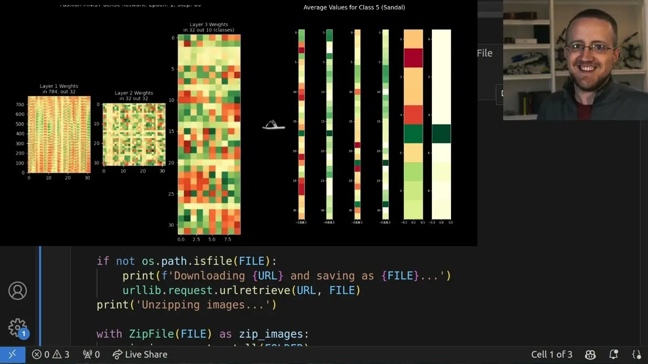
The process begins with a standard dataset, such as the Fashion MNIST dataset, which comprises images of clothing items like t-shirts, trousers, and bags, categorized into ten classes. This dataset serves as a practical testbed for training a neural network. The crucial innovation here is the modification of the training process to store detailed information from each layer. This includes not only the layer outputs and their corresponding activations but also the weights, biases, and their derivatives, along with momentum values if applicable.
This captured data is then used to generate visualizations. For instance, a single sample can be fed through the network, and its journey can be mapped across the layers. This allows for the observation of how the input data, initially a vector of pixel values (e.g., a 28×28 image reshaped into 784 values), is processed. The visualization can highlight the output of each layer, including the effect of activation functions like ReLU (Rectified Linear Unit), which introduces zeros where negative values would have occurred.
Layer Outputs and Activations
A key aspect of the visualization is distinguishing between a layer’s raw output and its output after activation. For a network with two hidden layers and one output layer, excluding the input layer, one might expect three sets of outputs. However, the visualization reveals six: the output of the first hidden layer, its activated output, the output of the second hidden layer, its activated output, and similarly for the final output layer. This distinction is vital for understanding the full transformation pipeline.
The visual representation typically employs a grid of subplots, where each subplot corresponds to a layer’s output. These outputs, initially vectors, are often rotated (e.g., by 90 degrees multiple times) to be displayed vertically, making them easier to interpret. Color mapping plays a significant role: raw layer outputs might use a spectrum from red to green, indicating values from negative to positive. Activated layers, however, often use a yellow-to-green palette, reflecting the non-negativity introduced by ReLU activation.
Analyzing Predictions and Errors
The visualizations can also dynamically display predictions for individual samples. By comparing the model’s prediction with the actual ground truth, the visualization can be color-coded (e.g., green for correct, red for incorrect) to immediately signal performance. This allows for a quick assessment of whether the model is correctly classifying the input, such as identifying a piece of clothing.
More profoundly, by animating these visualizations across multiple samples, patterns of misclassification become apparent. For example, in a Fashion MNIST classification task, even a model with high overall accuracy might consistently confuse certain classes, such as predicting class ‘2’ (often a shirt or pullover) when the actual item is class ‘4’ (a sneaker) or ‘6’ (a coat). This reveals specific weaknesses in the model’s understanding.
Averaging for Deeper Insights
To move beyond individual sample analysis and identify broader trends, the approach involves calculating the average layer outputs across all samples belonging to a specific class. This provides a generalized view of how the network processes each type of input. By comparing these averaged layer outputs for different true classes, one can discern how the network differentiates between them internally.
This averaged data can reveal critical information. For instance, it might show at which layer the distinction between classes begins to significantly diverge or where the network starts to become confused. Such insights can inform decisions about model architecture – whether more layers, wider layers, or different activation functions are needed. It can also help in diagnosing overfitting, where a model becomes too specialized to the training data and performs poorly on unseen data.
Why This Matters
The ability to visualize and analyze the internal states of neural networks is a significant step forward for several reasons:
- Improved Debugging: Developers can pinpoint exactly where and why a model is making errors, leading to more efficient debugging and model refinement.
- Enhanced Understanding: It demystifies AI, making complex models more interpretable and fostering greater trust in their outputs.
- Model Optimization: Insights gained can guide architectural choices, hyperparameter tuning, and training strategies to build more effective and efficient models.
- Bias Detection: Visualizing internal representations might help in identifying and mitigating biases that could be present in the training data or model logic.
- Educational Value: These visualization tools are invaluable for teaching and learning about neural networks, making abstract concepts tangible.
While the code presented is based on a custom ‘neural networks from scratch’ architecture for clarity, the principles can be applied to popular frameworks like TensorFlow or PyTorch. The underlying concept of capturing and visualizing intermediate layer data remains consistent, promising a future where AI models are not just powerful but also transparent and understandable.
Source: Visualizing Neural Network Internals (YouTube)