Master Shadcn UI’s New Project Creation and Customization Features
Shadcn UI has rolled out a significant update that allows you to create your own custom Shadcn UI projects with tailored themes. While the ability to build your own Shadcn UI is a headline feature, the true revolution lies in the enhanced customization and interoperability it offers. This guide will walk you through leveraging these powerful new features to streamline your development workflow and create unique user interfaces.
What You’ll Learn
This article will guide you through the new Shadcn UI project creation process. You will learn how to explore and apply different design presets, understand the impact of swapping underlying UI component libraries (like Radix UI and Base UI) and icon libraries, and discover how to generate a new project pre-configured with your chosen customizations. We’ll also touch upon the future implications of these updates for theme extensibility and component library compatibility.
Prerequisites
- Basic understanding of web development concepts.
- Familiarity with a JavaScript framework like Next.js, React, or Vite.
- Node.js and npm/yarn installed on your machine.
Step-by-Step Guide to Customizing and Creating Shadcn UI Projects
1. Explore Design Presets and Customization Options
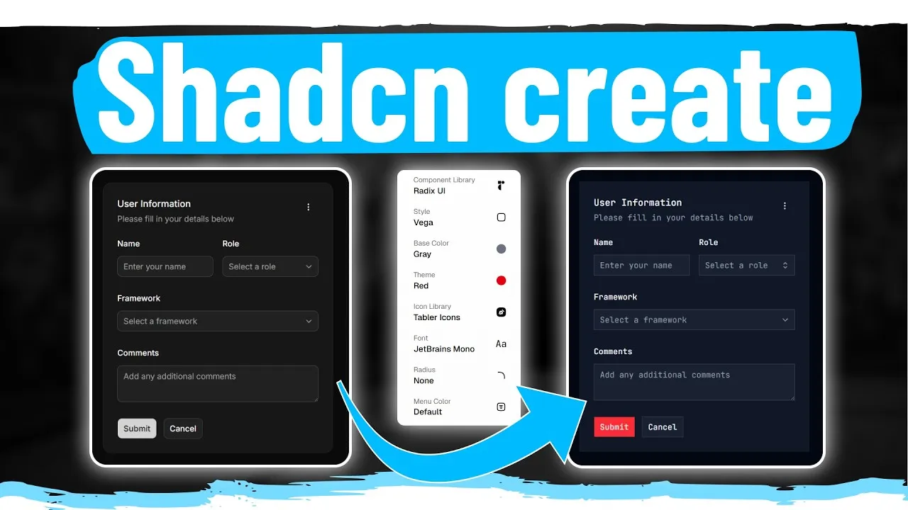
Navigate to the Shadcn UI ‘create’ page (shadcn.com/create). On the right-hand side, you’ll find a wealth of customization options:
- Presets: Choose from several predefined styles that alter the overall look and feel. Examples include:
- Vega: The default, standard Shadcn UI appearance.
- Nova: A more compact version with reduced spacing.
- Maya: Offers more spacing and rounded elements.
- Elra: Features squared-off elements and a monospace font.
- Myra: An even more compacted version with smaller fonts.
- Smile: Provides a rounded aesthetic with larger spacing.
- Base UI Library: This is a game-changer. You can now seamlessly switch between Radix UI and Base UI. Notice that the code remains identical, but the underlying component library changes, offering flexibility in your tech stack.
- Icon Library: Similarly, you can swap out your icon library. For instance, switching from one set to Lucid Icons will automatically update all icons across your project.
- Theming Options: While not as drastically impactful as the library swaps, you can adjust elements like primary colors, fonts, and border-radius. The ‘Style’ section, in particular, offers significant visual changes through randomization.
2. Understand the Impact of Library Swaps
The ability to switch between Radix UI and Base UI, as well as different icon libraries, is the most profound aspect of this update. Previously, changing these core dependencies would require a massive refactor. Now, Shadcn UI handles this interoperability, ensuring that your chosen components and icons work seamlessly regardless of the underlying library.
Expert Note: This interoperability lays the groundwork for future support of even more component and icon libraries, significantly future-proofing your projects and offering unparalleled flexibility.
3. Experiment with Theme Randomization
In the ‘Style’ section, click the ‘R’ key (or the randomize button) to cycle through various design permutations. This is an excellent way to quickly visualize different aesthetic possibilities for your project and discover unique looks beyond the standard presets.
Warning: While randomization offers variety, relying solely on the limited presets and basic color/radius adjustments might lead to visual overlap if many projects use the same default configurations. Consider deeper customization for truly unique branding.
4. Generate Your Custom Project
Once you’ve finalized your desired theme and library configurations:
- Scroll to the bottom of the customization page.
- Click the ‘Create Project’ button.
- Choose your preferred project setup: Next.js (Tanstack start), Next.js, or Vite.
- Copy the provided command.
- Open your terminal, navigate to your desired project directory, and paste the command.
This command will create a new project, install Shadcn UI, and apply all your selected customizations, including your chosen UI and icon libraries.
5. Review Your Generated Project
After the installation completes, open the newly created project in your code editor:
- You’ll find the Shadcn UI configuration and styles integrated into your project’s global files (e.g.,
globals.css). - The project will include an example page demonstrating your customized components and theme.
- You can inspect the code for any component (like the drawer or field components) to see how your theme is applied across different elements.
Tip: The generated example page is invaluable for testing how your chosen theme looks and behaves with various Shadcn UI components.
6. Compatibility with Custom Registries
The Shadcn UI team has ensured that these new styling and customization features work seamlessly with existing custom component registries. This means that if you use custom components (like a multi-select component) from your own registry or a third-party one, they will continue to function correctly with your newly generated Shadcn UI project.
Expert Note: This backward compatibility is crucial, preventing the loss of valuable custom components and ensuring a smooth transition to the new customization workflow.
Conclusion and Future Outlook
The ability to swap base UI and icon libraries, coupled with the streamlined project generation, marks a significant leap forward for Shadcn UI. While the current theme customizer is somewhat limited, it’s evident that this system is designed for future expansion, potentially evolving into a comprehensive theme builder akin to tools like TweakCN. This update empowers developers to create more distinct and customized user experiences with greater ease and flexibility than ever before.
For more advanced customization and to learn how to build your own component registries, check out the linked resources in the description.
Source: Everyone Is Missing What Makes NEW Shadcn Update Amazing (YouTube)