How to Create Dynamic Hover Effects with CSS Anchor Positioning
Unlock the power of modern CSS to create engaging and dynamic hover effects without relying on JavaScript. This tutorial will guide you through using CSS Anchor Positioning to build an animated highlight that follows your cursor, offering a sleek and interactive user experience. We’ll cover setting up the anchor, applying the positioning, and adding smooth transitions for a polished finish.
What You’ll Learn
- How to set up and utilize CSS Anchor Positioning.
- Creating an animated hover effect using pseudo-elements.
- Applying transitions for smooth and engaging animations.
- Understanding the behavior of anchor names with multiple elements.
Prerequisites
- Basic understanding of HTML and CSS.
- Familiarity with CSS pseudo-elements (
::before,::after). - A modern browser that supports CSS Anchor Positioning (support is becoming widespread).
Step-by-Step Guide
Step 1: Set Up Your HTML Structure
Begin with simple HTML. We need a navigation element and links within it. Crucially, one of these elements will serve as our anchor. We’ll assign a specific anchor-name to this element, which our effect will later target.
For this example, let’s assume you have a navigation list like this:
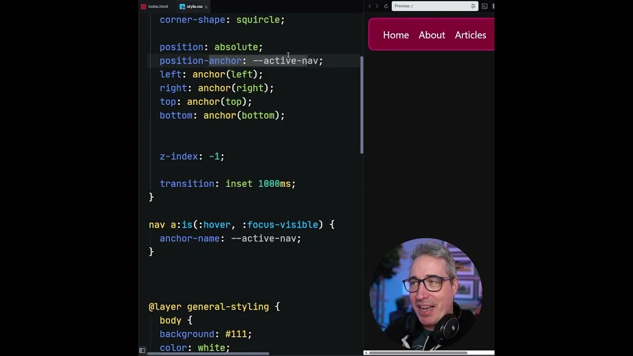
<nav>
  <a href="#" anchor-name="--active-nav">Home</a>
  <a href="#">About</a>
  <a href="#">Services</a>
  <a href="#">Contact</a>
</nav>
In this structure, the first link has the anchor-name set to --active-nav. This name will be used to link our positioning element to this specific anchor point.
Step 2: Style the Anchor Element and Pseudo-Element
Next, we’ll style the navigation and prepare a pseudo-element that will act as our animated highlight. This pseudo-element will be absolutely positioned and anchored to the element defined in Step 1.
Add the following CSS:
nav {
  /* Basic styling for navigation */
  display: flex;
  gap: 20px;
  padding: 10px;
  background-color: #f0f0f0;
}

nav a {
  text-decoration: none;
  color: #333;
  padding: 8px 12px;
  position: relative; /* Needed for containing block context if not using anchor positioning directly */
}

/* The pseudo-element that will create the effect */
nav::after {
  content: '';
  background-color: #007bff;
  border-radius: 4px;
  opacity: 0;
  transition: opacity 0.3s ease;

  /* Anchor Positioning */
  position: absolute;
  anchor-default: --active-nav;
  anchor-visibility: auto;

  /* Positioning based on the anchor */
  top: 0;
  bottom: 0;
  left: 0;
  right: 0;
  inset: 0;

  /* Initial state - hidden */
  transform: scale(0.95);
  opacity: 0;
}
Explanation:
- We style the
navfor basic layout. - The
nav aelements are styled for appearance. - The
nav::afterpseudo-element is created. It has a background color and will be our visual indicator. position: absolute;allows us to position it freely.anchor-default: --active-nav;tells this pseudo-element to use the element with the--active-navanchor name as its reference point.inset: 0;(a shorthand fortop: 0; bottom: 0; left: 0; right: 0;) instructs the pseudo-element to stretch and align itself precisely with the dimensions of its anchor.- Initially, the pseudo-element is hidden with
opacity: 0;and slightly scaled down.
Important Note: Notice the absence of position: relative; on the parent nav. When using anchor positioning, explicitly setting a containing block with position: relative; on the parent can interfere with how anchor positioning calculates its position. Anchor positioning handles its own context.
Step 3: Trigger the Effect on Hover and Focus
Now, we need to make the pseudo-element visible and dynamic when a user interacts with the navigation links. We’ll use the :hover and :focus-visible pseudo-classes on the navigation links to change the anchor name reference and reveal the highlight.
Add the following CSS to your stylesheet:
nav a:hover ~ ::after,
nav a:focus-visible ~ ::after {
  anchor-name: --active-nav;
  opacity: 1;
  transform: scale(1);
  transition: transform 0.3s ease, opacity 0.3s ease;
}

/* Specific styling for the hovered/focused link to ensure it's the active anchor */
nav a[anchor-name="--active-nav"]:hover ~ ::after,
nav a[anchor-name="--active-nav"]:focus-visible ~ ::after {
  anchor-name: --active-nav;
  opacity: 1;
  transform: scale(1);
  transition: transform 0.3s ease, opacity 0.3s ease;
}

/* When a specific link is hovered/focused, it becomes the anchor */
nav a:hover {
  anchor-name: --active-nav;
}
nav a:focus-visible {
  anchor-name: --active-nav;
}
Explanation:
nav a:hover ~ ::after, nav a:focus-visible ~ ::after: This selector targets the::afterpseudo-element of thenavwhen anyaelement inside it is hovered or focused. It sets theanchor-nameto--active-nav, making the highlight appear.opacity: 1;andtransform: scale(1);bring the pseudo-element into view smoothly.transition: transform 0.3s ease, opacity 0.3s ease;ensures the appearance and scaling are animated.- The subsequent rules specifically target the link that *has* the
anchor-name="--active-nav"attribute, ensuring that when that specific link is interacted with, it correctly re-establishes itself as the anchor for the pseudo-element. This clarifies which element the pseudo-element should be anchored to. nav a:hover { anchor-name: --active-nav; }andnav a:focus-visible { anchor-name: --active-nav; }are crucial. They dynamically assign the--active-navanchor name to the specific link being hovered or focused. This is how the highlight knows which link to follow.
How Anchor Names Work: If multiple elements share the same anchor-name, the browser will always consider the *last* one defined in the DOM or CSS cascade. By dynamically assigning the anchor-name to the hovered/focused link, we ensure that the pseudo-element always anchors to the currently interacted element.
Step 4: Add Advanced Transitions and Easing
To make the effect even more visually appealing, we can add custom transitions and easing functions. This gives the animation a more natural and engaging feel.
You can use a tool like easings.net to find interesting easing functions. Let’s add a spring-like effect.
First, define a custom property for the transition timing function:
:root {
  --spring-ease: cubic-bezier(0.18, 0.61, 0.55, 1); /* Example spring-like easing */
}

nav a:hover ~ ::after,
nav a:focus-visible ~ ::after {
  anchor-name: --active-nav;
  opacity: 1;
  transform: scale(1);
  transition: transform 0.4s var(--spring-ease), opacity 0.4s var(--spring-ease);
}

nav a[anchor-name="--active-nav"]:hover ~ ::after,
nav a[anchor-name="--active-nav"]:focus-visible ~ ::after {
  anchor-name: --active-nav;
  opacity: 1;
  transform: scale(1);
  transition: transform 0.4s var(--spring-ease), opacity 0.4s var(--spring-ease);
}
Explanation:
- We define a CSS custom property
--spring-easewith a cubic-bezier value that mimics a spring effect. - We then apply this custom property to the
transition-timing-functionwithin the transition property for bothtransformandopacity. - Adjust the duration (e.g.,
0.4s) as needed.
Expert Tip: For more complex positioning, especially if the anchor and the anchored element have different sizes or aspect ratios, you can use properties like anchor-scroll, anchor-cover, or combine anchor() with other CSS functions like calc() for fine-tuned control.
Conclusion
You’ve now successfully implemented a dynamic hover effect using only CSS Anchor Positioning. This technique provides a powerful and efficient way to add interactive elements to your web designs, enhancing user experience without the need for JavaScript. As browser support for anchor positioning continues to grow, it’s an excellent tool to add to your front-end development toolkit for creating modern, performant, and engaging web interfaces.
Source: This shouldn't be possible with CSS (YouTube)