Master New CSS Scroll Features to Eliminate JavaScript
CSS has introduced powerful new features that allow for complex scroll-based animations and interactive elements without relying on JavaScript. This article will guide you through implementing these features, including scroll-to-top buttons, sticky header effects, interactive tables of contents, and fully functional carousels, all using pure CSS.
Understanding Scroll State and Container Queries
The core of these new CSS capabilities lies in the scroll state, a new container type that enables container queries based on the scroll position within an element, rather than its dimensions. This allows elements to react dynamically to user scrolling.
1. Implementing a Scroll-to-Top Button
Create a button that appears only when the user can scroll and provides a quick way to return to the top of the page.
- Define the Scroll Container: Apply the
container-type: scroll-state;property to the main scrollable element (e.g.,htmlor a specific wrapper). Assign a name usingcontainer-name: page;for easy referencing.html { container-type: scroll-state; container-name: page; } - Query Scroll State: Use a container query to check if the page is scrollable upwards. This condition is met when the user has scrolled down.
@container page (scroll-state: upward) {
  /* Styles to apply when scrollable upwards */
}
Expert Note: The
scroll-state: upwardchecks if there is content above the current viewport, meaning the user can scroll up. Other possible values includedownward,leftward,rightward, andany-direction. - Style the Button: Initially, hide the scroll-to-top button off-screen using CSS transforms (e.g.,
transform: translateX(80px);). Inside the container query, reset the transform tononeortranslateX(0)to make it visible..scroll-top-button { transform: translateX(80px); transition: transform 0.3s ease-in-out; } @container page (scroll-state: upward) { .scroll-top-button { transform: none; } } - Add Smooth Scrolling: Use a simple anchor tag (
<a href="#top">Scroll to Top</a>) where the#topID is applied to the top of your page (e.g.,<body id="top">). This provides native smooth scrolling behavior.
2. Styling Sticky Headers Based on Scroll Position
Apply different styles to a sticky header depending on whether it’s actively stuck to the top of the viewport or still scrolling with the page.
- Apply Container Type to Sticky Element: Place
container-type: scroll-state;andcontainer-name: header;directly on the element that usesposition: sticky;..site-header { position: sticky; top: 0; container-type: scroll-state; container-name: header; } - Query the ‘Stuck’ State: Use a container query to check if the sticky element is currently in its ‘stuck’ state.
@container header (scroll-state: stuck) {
  /* Styles for when the header is stuck */
  .site-header {
    background-color: white;
    box-shadow: 0 2px 4px rgba(0,0,0,0.1);
  }
}
Tip: When an element has
position: stickyand is currently adhering to itstop,bottom,left, orrightoffset relative to the viewport, it is considered ‘stuck’. - Define Unstuck Styles: Style the header for when it’s not stuck (i.e., when the container query doesn’t apply). This could involve different background colors or shadows.
.site-header {
  /* Default styles when not stuck */
  background-color: transparent;
}
3. Creating an Auto-Updating Table of Contents
Dynamically highlight the current section in a table of contents as the user scrolls through the page.
- Enable Scroll Target Group: Add
scroll-behavior: smooth;to your main scroll container and applyscroll-target-group: auto;to the element containing your navigation links.body { scroll-behavior: smooth; } .table-of-contents { scroll-target-group: auto; } - Link Navigation to Content IDs: Ensure each link in your table of contents has an
hrefpointing to an ID of a corresponding section on the page (e.g.,<a href="#section1">Section 1</a>). Each section should have a matching ID (e.g.,<div id="section1">...</div>). - Apply ‘Current Target’ Styling: Use the
:target-currentpseudo-class on your navigation links within the scroll target group to apply styles when that link’s corresponding section is currently in view..table-of-contents a:target-current { color: blue; font-weight: bold; }Note: The browser automatically determines which section is currently in view and applies the
:target-currentstate to the corresponding link.
4. Building a CSS-Only Carousel with Animations
Construct a fully functional carousel with navigation buttons, swipe gestures, and entry/exit animations, all without JavaScript.
4.1. Customizing Scroll Snap Points and Indicators
Use scroll-snap-type for smooth snapping and scroll-marker-group and scroll-marker for custom navigation indicators (like dots).
- Set Up Scroll Snapping: Apply
scroll-snap-type: x mandatory;(oryfor vertical) to the carousel container. Ensure child elements are styled to occupy the full width/height of the snap interval..carousel { overflow-x: auto; scroll-snap-type: x mandatory; display: flex; } .carousel-slide { flex-shrink: 0; width: 100%; scroll-snap-align: start; } - Define Scroll Marker Group: Add
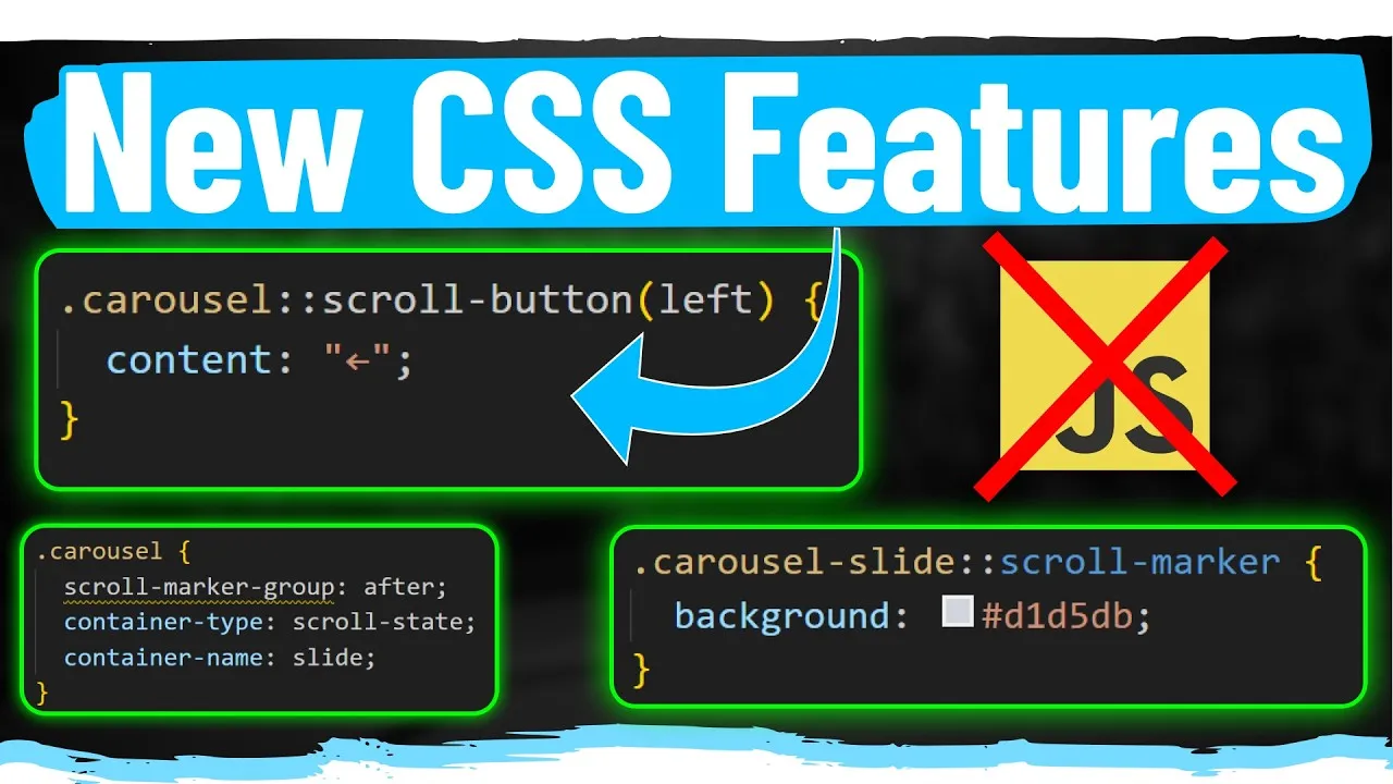
scroll-marker-groupto a container that will hold your custom indicators..carousel-indicators { scroll-marker-group: custom-markers; } - Style Individual Scroll Markers: Use the
scroll-markerpseudo-element on the elements you want to represent as indicators (e.g., slides). This automatically creates a marker for each element..carousel-slide::scroll-marker { /* Styles for each dot indicator */ width: 10px; height: 10px; background-color: grey; border-radius: 50%; margin: 0 5px; } - Highlight Active Marker: Use
:target-currenton the scroll markers to indicate the active slide, similar to the table of contents..carousel-slide:target-current::scroll-marker { background-color: blue; } - Add Custom Scroll Buttons: Utilize the
::scroll-buttonpseudo-element on the carousel container. Specify the direction (e.g.,left,right) and provide content..carousel::scroll-button(left) { content: ''; /* Styles for the right button */ }Note: The browser automatically handles disabling these buttons when the end of the scrollable content is reached. The default scroll amount for these buttons is typically one full snap interval.
4.2. Implementing Fade and Scale Animations
Animate carousel slides in and out based on their visibility and snap state.
- Track Slide State: Apply
container-type: scroll-state;andcontainer-name: slide;to each carousel slide wrapper..carousel-slide { /* ... other styles */ container-type: scroll-state; container-name: slide; } - Query Snap State: Use container queries to check if the slide is currently snapped in the horizontal (X) direction.
@container slide (scroll-state: snapped(x)) { .carousel-slide { opacity: 1; transform: scale(1); } } - Define Default (Off-Screen) Styles: Set default styles for slides that are not currently snapped, such as reduced opacity and scale. These styles apply when the container query condition is false.
.carousel-slide {
  opacity: 0.5;
  transform: scale(0.75);
  transition: opacity 0.3s ease, transform 0.3s ease;
}
Tip: Hiding the scrollbar (e.g., using
scrollbar-width: none;) can provide a cleaner carousel appearance.
Conclusion
These new CSS scroll features, including scroll-state, scroll-target-group, :target-current, ::scroll-marker, ::scroll-marker-group, and ::scroll-button, offer powerful ways to create dynamic, interactive, and animated user interfaces without needing JavaScript. Experiment with these properties to enhance your web designs.
Source: NEW CSS Scroll Features are Game Changers (YouTube)