Master the CSS `corner-shape` Property for Unique Borders
The `corner-shape` property in CSS is a powerful and relatively new feature that allows you to move beyond standard rounded corners and create intricate, eye-catching shapes for your elements. This tutorial will guide you through understanding and utilizing the `corner-shape` property, enabling you to craft unique designs with ease.
What You’ll Learn
By the end of this article, you will understand:
- The basic concept of the CSS `corner-shape` property.
- How to use keywords like `round`, `square`, `notch`, and `scoop`.
- The underlying principles of the superellipse function used by `corner-shape`.
- How to animate `corner-shape` for dynamic effects.
Prerequisites
A basic understanding of CSS, including how to apply styles to HTML elements and familiarity with properties like `border-radius`.
Understanding `corner-shape`
The `corner-shape` property is designed to offer more control over the shape of an element’s corners than the traditional `border-radius` property. It essentially uses a mathematical function called a superellipse to define the curvature, allowing for a much wider range of possibilities, from sharp corners to inverted curves and notches.
Using `corner-shape` Keywords
The simplest way to use `corner-shape` is with predefined keywords. These keywords provide quick access to common or interesting shapes.
The `round` Keyword
Using `round` as the value for `corner-shape` behaves identically to a standard `border-radius`. It creates a smooth, circular curve at the corners. This is useful for maintaining consistency or when you want the default rounded look.
Example:
.element {
  border: 2px solid black;
  border-radius: 10px;
  corner-shape: round;
}
As you scale the element, the corner will maintain its standard rounded appearance.
The `square` Keyword
The `square` keyword effectively removes any `border-radius` effect, resulting in sharp, 90-degree corners. This is the default behavior for most elements, but explicitly setting it can be useful for overriding other styles or ensuring a crisp edge.
Example:
.element {
  border: 2px solid black;
  border-radius: 10px;
  corner-shape: square;
}
The corners will appear perfectly square, regardless of any `border-radius` value applied.
The `notch` Keyword
The `notch` keyword creates an inverse border radius, resulting in a shape where a section is ‘notched out’ from the corner. This gives a unique, cut-in effect.
Example:
.element {
  border: 2px solid black;
  border-radius: 20px;
  corner-shape: notch;
}
This will create a distinct inward-facing curve at each corner.
The `scoop` Keyword
Similar to `notch`, `scoop` also creates an inverse border radius. However, `scoop` is described as a ‘true’ inverse border radius, often resulting in a smoother, more concave curve compared to `notch`.
Example:
.element {
  border: 2px solid black;
  border-radius: 20px;
  corner-shape: scoop;
}
This keyword provides another way to achieve an inverted corner shape, offering a slightly different aesthetic than `notch`.
Understanding the Superellipse Function
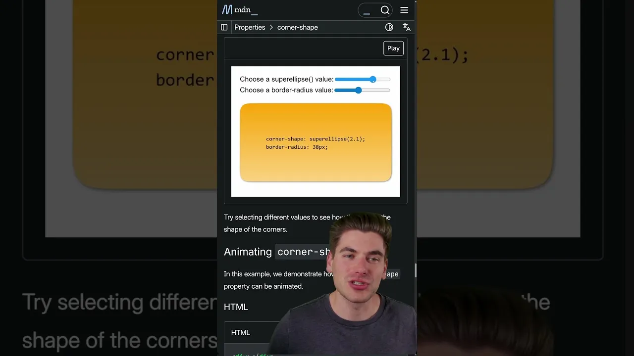
At its core, `corner-shape` is powered by the superellipse function. This mathematical concept allows for a continuous range of shapes between a circle and a rectangle, and also extends to inverted curves. The values you provide (or the keywords that map to them) influence this function.
How Values Affect the Shape
While keywords are straightforward, understanding the underlying numerical values gives you finer control. The superellipse function can be thought of as having a parameter that dictates the shape:
- Value of 0: This results in a perfectly diagonal line (45° angle) at the corner, creating a sharp, angled cut rather than a curve.
- Value of 1: This corresponds to the default `border-radius` behavior, creating a standard circular curve.
- Values greater than 1: As the value increases beyond 1, the curvature decreases, making the corner less rounded. An infinitely large value effectively removes the border radius, resulting in sharp corners (similar to `square`).
- Values less than 0: Negative values introduce inverted curves. A value of -1 is the exact opposite of a standard `border-radius` (value of 1). As the value becomes more negative (e.g., -2, -3), the corner becomes more ‘squared off’ in its inversion. A value approaching negative infinity results in a full notch being taken out of the corner, similar to the `notch` keyword but potentially more pronounced.
By combining `corner-shape` with `border-radius`, you can create extremely intricate and unique border designs. For instance, you can apply a large `border-radius` and then use `corner-shape` with a value less than 1 to create a subtle rounded edge, or use a negative `corner-shape` value with a specific `border-radius` to craft complex cutouts.
Animating `corner-shape`
One of the most exciting applications of `corner-shape` is its animatability. You can transition between different `corner-shape` values or animate the underlying superellipse parameter to create dynamic and visually engaging effects.
Example Animation
Imagine animating the `corner-shape` value from `round` to `notch`, or animating a numerical value from 0 to 5. This can produce fluid transitions that morph the element’s corners in fascinating ways.
Example (Conceptual CSS):
.animated-element {
  width: 150px;
  height: 150px;
  background-color: dodgerblue;
  border-radius: 30px;
  corner-shape: round;
  animation: morphCorners 4s infinite alternate;
}

@keyframes morphCorners {
  0% {
    corner-shape: round;
  }
  50% {
    corner-shape: scoop;
    border-radius: 50px;
  }
  100% {
    corner-shape: notch;
    border-radius: 20px;
  }
}
This kind of animation can add a unique flair to interfaces, loading indicators, or decorative elements.
Browser Support
Important Note: As of the current time, the `corner-shape` property is primarily supported in Chromium-based browsers (like Chrome, Edge, and Opera). While it’s a promising new feature, you should check caniuse.com for the latest compatibility information before relying on it for production websites that need to support a wide range of browsers. Support in other browsers like Firefox and Safari is expected to be added in the future.
Conclusion
The CSS `corner-shape` property offers a significant leap forward in controlling element aesthetics. By leveraging keywords and understanding the superellipse function, you can move beyond simple rounded corners to create sophisticated and unique designs. Experiment with different values and animations to unlock the full potential of this exciting CSS feature.
Source: CSS corner-shape Is an Amazing NEW Property! (YouTube)