How to Make Your Text Look Great with CSS Text Wrap
This guide will show you how to use two modern CSS properties, text-wrap: balance and text-wrap: pretty, to improve the appearance of your text. You’ll learn how to balance headings across multiple lines and prevent single words from appearing alone on the last line of a paragraph.
What You’ll Learn
By the end of this tutorial, you will understand how to apply text-wrap: balance to create visually appealing, evenly distributed headings. You will also learn how to use text-wrap: pretty to eliminate awkward single words at the end of paragraphs, making your text more readable and professional.
Prerequisites
- Basic understanding of HTML structure.
- Familiarity with applying CSS to HTML elements.
Step-by-Step Guide
Step 1: Understanding Text Wrap Balance
The text-wrap: balance property is designed to make headings look better, especially when they span multiple lines. It helps distribute the text more evenly across those lines. Imagine a heading that’s too long for one line. Without balance, it might break awkwardly, leaving one line much shorter than the other. This property aims to make those lines more similar in length, creating a more pleasing visual effect for your titles.
This is particularly useful for large headings with short lines of text. For instance, a main title on a webpage might naturally break into two or three lines. Applying text-wrap: balance will adjust the line breaks so that the text fills the space more evenly, preventing one line from looking significantly shorter or longer than the others.
Step 2: Applying Text Wrap Balance
To use this property, you simply add it to your CSS rules for the heading element you want to affect. For example, if you have an h1 element, you would write the following CSS:
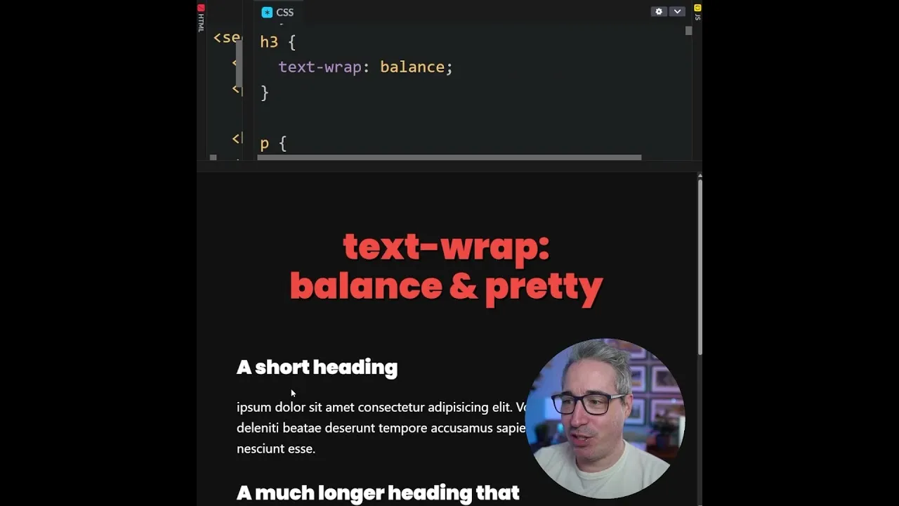
h1 {
  text-wrap: balance;
}
When you apply this, watch how the heading text rearranges itself. You’ll see the lines become more balanced in length. This change can make your headings appear more professional and easier to read at a glance. It’s a small change that can have a big impact on the overall design.
Step 3: Understanding Text Wrap Pretty (Preventing Orphans)
Next, let’s look at text-wrap: pretty. This property is designed to solve a common typographic issue called an “orphan.” An orphan is when the very last line of a paragraph contains only a single word. This single word sitting alone on its own line can look awkward and unprofessional. It disrupts the flow of the text and can make the paragraph seem unfinished.
text-wrap: pretty works by preventing these single-word lines. If a paragraph would naturally end with just one word on the last line, this property will adjust the preceding lines. It might slightly change the spacing or line breaks in the lines above. The goal is to ensure that the last line of the paragraph has at least two words, making the text look more complete and polished.
Step 4: Applying Text Wrap Pretty
Similar to text-wrap: balance, you apply text-wrap: pretty directly in your CSS. You can apply it to paragraph elements (p tags) or any other block of text where you want to avoid single-word endings. Here’s how you would apply it to all paragraphs:
p {
  text-wrap: pretty;
}
Once applied, check your paragraphs. If any of them ended with just one word before, you’ll notice that word is now on the same line as the word before it. This creates a cleaner look for your body text. It helps maintain a consistent and pleasing visual rhythm throughout your content.
Step 5: Combining Both Properties
You can use both text-wrap: balance and text-wrap: pretty in your CSS project. They address different aspects of text presentation. Balance is mainly for headings to make multi-line titles look good. Pretty is for paragraphs and other text blocks to avoid single words on the last line.
Many modern CSS resets are starting to include these properties. This suggests they are becoming standard best practices for web typography. By adding them to your own CSS, you can easily improve the appearance of your website’s text without complex adjustments. It’s a simple way to make your content more readable and visually appealing for your visitors.
Expert Notes
While these properties are powerful, browser support is still growing. Always test your designs across different browsers to ensure consistent results. For older browsers that don’t support these properties, your text will simply render without these specific adjustments, which is a safe fallback.
Consider the context. text-wrap: balance works best on larger font sizes and shorter line lengths, common in headings. For body text, it might not have a noticeable effect or could even create less readable lines if used inappropriately. text-wrap: pretty is generally safe for most text blocks, aiming for a more aesthetically pleasing end to paragraphs.
Source: Two new lines for your CSS reset (YouTube)