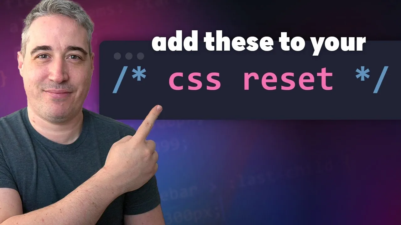
How to Make Your Web Pages Look Better With These 3 CSS Tricks
This guide will show you three modern CSS properties you can add to your website’s basic styles. These simple additions can fix common layout issues and improve how your pages look and feel, especially on different devices. You’ll learn how to keep your footer at the bottom of short pages, stop your navigation from jumping, and create smooth animations for expandable content.
Prerequisites
Basic understanding of HTML and CSS structure. Familiarity with CSS properties like `display`, `min-height`, and `grid` is helpful but not strictly required.
1. Keep Your Footer at the Bottom of the Page
Have you ever seen a webpage where the footer is stuck near the top because there isn’t much content? This happens on short pages. We can fix this by telling the main part of the page to take up at least all available screen space. This pushes the footer down, even if the page content is very short.
- Target your main content area: You’ll likely apply this to your main content wrapper, which might be a `
` tag or a ` `.- Use `min-block-size` with `100svh`: Add the CSS property `min-block-size: 100svh;` to your main content container. This tells the container to be at least as tall as the full height of the browser window, even if the content is short. The `svh` unit stands for “small viewport height” and is generally more reliable on mobile devices than `vh` or `dvh` because it doesn’t change unexpectedly when on-screen elements appear or disappear.
- Set up your layout with CSS Grid: To make sure your header, main content, and footer stack correctly and the footer is pushed down, use CSS Grid. Apply `display: grid;` to the container holding your header, main, and footer. Then, use `grid-template-rows: auto 1fr auto;`. This tells the grid to make the header and footer just tall enough for their content (`auto`), while the main content takes up all the remaining space (`1fr`), pushing the footer to the bottom.
Expert Tip: Using `min-block-size` instead of `min-height` is a more modern approach that works better with different writing directions (like right-to-left text). `100svh` is preferred over `100vh` or `100dvh` because it provides a more stable height, especially on mobile devices where browser toolbars can appear and disappear.
2. Stop Your Navigation From Jumping
Sometimes, when you move between pages, especially from a page with a lot of content to one with less, your navigation bar might seem to jump or shift. This often happens because of the scrollbar on the side of the browser window. If a page doesn’t need a scrollbar, the space it would take up is removed, causing other elements to move.
- Target the root element: Apply this to the “ element in your CSS.
- Use `scrollbar-gutter: stable;` Add the CSS property `scrollbar-gutter: stable;` to your “ element. This tells the browser to always reserve space for a scrollbar, even if the page doesn’t currently need one. This keeps the layout consistent and prevents elements like your navigation from shifting when you go between pages of different lengths.
Expert Tip: This simple fix makes your website feel more stable and professional. It also helps future-proofing your site, as newer browser versions will account for this reserved space when calculating widths like `100vw` (100% of the viewport width), preventing unexpected horizontal scrolling.
3. Animate Expandable Content Smoothly
Many websites use elements like accordions or collapsible sections, often built with `
` and `` tags. Normally, animating the opening and closing of these sections can be tricky because you can’t directly animate between a height of `0` and `auto` (which means “fit content”).
- Target the element to animate: You’ll typically apply this to the content that expands, often a `details` element or a specific class within it.
- Use `transition: allow-keywords;` Add the CSS property `transition-allow-keywords: allow-keywords;` to the element you want to animate. This allows CSS transitions to work with intrinsic sizing keywords like `auto`.
- Define the transition: Set up a `transition` property. For example, `transition: block-size 0.3s ease;`. This will make the `block-size` (which controls the height for vertical expansion) animate smoothly over 0.3 seconds.
- Consider `prefers-reduced-motion` For users who are sensitive to motion, it’s good practice to disable or reduce animations. You can do this by wrapping your animation styles within an `@media (prefers-reduced-motion: reduce)` block. This ensures that if a user has enabled reduced motion settings in their operating system, the animation will be skipped, and the content will just appear or disappear instantly.
Expert Tip: By using `transition-allow-keywords`, you can now animate properties like `block-size` from a fixed value (like `0`) to `auto`, creating smooth, natural-looking animations for expandable content. Remember to always consider accessibility by respecting the `prefers-reduced-motion` media query.
Source: 3 modern CSS properties to add to your reset (YouTube)