How to Make Your Website Navigation Stick with Pure CSS
In this tutorial, you’ll learn how to implement a sticky navigation bar on your website using only CSS, eliminating the need for JavaScript. We’ll explore two methods: the well-supported position: sticky and the more experimental, but powerful, CSS Scroll-driven Animations API.
Understanding Sticky Navigation
A sticky navigation bar is a common UI pattern where the navigation menu remains fixed at the top of the viewport as the user scrolls down the page. Traditionally, this was often achieved with JavaScript to detect scroll position and apply a fixed position. However, modern CSS offers more elegant solutions.
Prerequisites
- Basic understanding of HTML and CSS.
- An existing website project where you want to implement a sticky navigation.
Method 1: Using position: sticky (Well-Supported)
This method leverages the position: sticky CSS property, which is widely supported across modern browsers. It allows an element to be treated as relatively positioned until it crosses a specified threshold in the viewport, at which point it becomes fixed.
Step 1: Structure Your HTML
Ensure your HTML has a clear structure where the navigation element (e.g., a header or nav tag) is placed before the main content that will scroll underneath it.
Example HTML structure:
<header>
  <!-- Your navigation links and logo -->
</header>

<main>
  <!-- Your page content -->
</main>
Step 2: Apply position: sticky
In your CSS, target your navigation element. Apply position: sticky and define the offset from the top of the viewport where it should become sticky. A common value is top: 0;.
Example CSS:
header {
  position: sticky;
  top: 0;
  z-index: 100; /* Ensure it stays above other content */
}
Step 3: Add Content Offset (Optional but Recommended)
To prevent the sticky header from overlapping your main content immediately, you might need to add some top padding or margin to the element directly following the header. This ensures there’s enough space for the header to occupy when it becomes sticky.
Example CSS:
main {
  padding-top: 80px; /* Adjust based on your header's height */
}
Expert Note:
position: sticky requires a parent element to define its scrolling container. In most cases, the default behavior (scrolling within the viewport) works fine. Ensure your sticky element is not the root element itself if you encounter issues.
Method 2: Using CSS Scroll-Driven Animations (Experimental)
This method uses the newer CSS Scroll-Driven Animations API, which offers more control over animations tied to scroll progress. While it provides powerful capabilities, browser support is not yet as comprehensive as position: sticky.
Step 1: Structure Your HTML
Similar to the first method, ensure your navigation is structured correctly. For this method, it’s beneficial to have the element you want to animate (e.g., the navigation) as a distinct child element within a container that will scroll.
Example HTML structure:
<div class="scroll-container">
  <header class="animated-nav">
    <!-- Your navigation links and logo -->
  </header>
  <main>
    <!-- Your page content -->
  </main>
</div>
Step 2: Define Keyframes for Animation
Create CSS keyframes to define the states of your animation. For a slide-in effect, you might animate the transform property.
Example CSS Keyframes:
@keyframes slideNavIn {
  from {
    transform: translateY(-100%); /* Start off-screen */
  }
  to {
    transform: translateY(0); /* End in its normal position */
  }
}
Step 3: Apply Scroll-Driven Animation Timeline
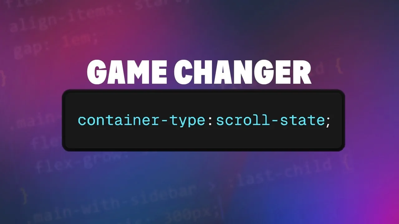
Apply the animation to your navigation element. Use animation-timeline: scroll() to link the animation to the scroll progress of the page (or a specific container). You’ll also define the animation-range to specify when the animation should occur relative to the scroll position.
Example CSS:
.animated-nav {
  position: sticky;
  top: 0;
  animation: slideNavIn linear forwards;
  animation-timeline: scroll();
  animation-range: 0px 200px; /* Animate between 0px and 200px scrolled */
}
Explanation of Properties:
animation: slideNavIn linear forwards;: Applies the defined keyframes, uses a linear timing function, and keeps the element in its final state after the animation.animation-timeline: scroll();: Ties the animation’s progress to the scroll position of the viewport.animation-range: 0px 200px;: This is crucial. It means the animation will start when the user has scrolled 0 pixels (from the top of the scrollable area) and will be fully complete when they have scrolled 200 pixels. You can adjust these values to control when and how the animation plays out. For instance,200px 400pxwould mean the animation starts after 200px of scrolling and finishes after 400px.
Expert Note:
The animation-range can be defined in various ways, including using percentages (e.g., 0% 10%) or pixel values. Experiment with these to achieve the exact scroll-driven effect you desire. If you want the animation to only start after a certain scroll distance, you can set the start of the range to that value (e.g., 200px 400px).
Improving Browser Support
For broader compatibility, you can use the @supports rule to provide the position: sticky fallback for browsers that don’t support scroll-driven animations.
.animated-nav {
  /* Default styles first */
  position: sticky;
  top: 0;
  z-index: 100;
}

@supports (animation-timeline: scroll()) {
  .animated-nav {
    animation: slideNavIn linear forwards;
    animation-timeline: scroll();
    animation-range: 0px 200px;
    /* Override default sticky if needed, or ensure it complements */
  }
}
Conclusion
Implementing a sticky navigation bar with pure CSS is now more accessible than ever. Whether you opt for the robust position: sticky or the cutting-edge CSS Scroll-Driven Animations API, you can enhance your website’s user experience without relying on JavaScript. CSS continues to evolve, offering powerful tools for creating dynamic and engaging interfaces.
Source: How I made the slide in nav on my website (YouTube)