Master Advanced CSS Border Radius Shapes
CSS border-radius is a powerful property for styling elements, but it goes beyond simple rounded corners. Modern CSS offers creative ways to shape element corners, adding unique visual flair to your designs. This guide will walk you through using these advanced border-radius values to achieve effects like scoops, squirles, notches, and bevels, all with simpler syntax.
What You’ll Learn
In this tutorial, you will learn how to:
- Apply unique corner shapes like scoop, squirle, notch, and bevel using the
border-radiusproperty. - Understand that these are shorthand for the more complex
super-ellipseproperty. - Utilize the shorthand syntax for easier implementation.
- Consider progressive enhancement for browser compatibility.
Prerequisites
- Basic understanding of CSS properties.
- Familiarity with applying styles to HTML elements.
How to Apply Advanced Corner Shapes
The border-radius property in CSS is typically used for creating rounded corners. However, it supports several keyword values that allow for more stylized shapes. These keywords are essentially shortcuts for the underlying super-ellipse functionality, making complex shapes easy to implement.
Step 1: Understanding the Basics of `border-radius`
Before diving into the advanced shapes, let’s recall the standard usage of border-radius. You can apply it to all corners, or specify individual corners. For example:
.element {
  border-radius: 10px; /* Rounds all corners */
  border-top-left-radius: 20px; /* Rounds only the top-left corner */
}
Step 2: Applying the `scoop` Shape
One of the more intuitive advanced shapes is scoop. This creates a concave, scooped-out effect on the corner.
How to implement:
- Select the HTML element you want to style.
- Apply the
border-radiusproperty with the valuescoop.
.element {
  border-radius: scoop;
}
This will apply the scoop effect to all corners of the element.
Step 3: Using the `squirle` Shape
The squirle value offers a more stylized, non-uniform curve, distinct from the standard elliptical curve. It provides a unique, almost organic shape to the corners.
How to implement:
- Target the desired HTML element.
- Set the
border-radiusproperty tosquirle.
.element {
  border-radius: squirle;
}
This applies the squirle shape to all corners.
Step 4: Implementing the `notch` Shape
The notch value creates a sharp, inward-facing cut at the corner, similar to a V-shape cut-out.
How to implement:
- Choose the element for styling.
- Assign
border-radius: notch;to the element.
.element {
  border-radius: notch;
}
This will give all corners a notched appearance.
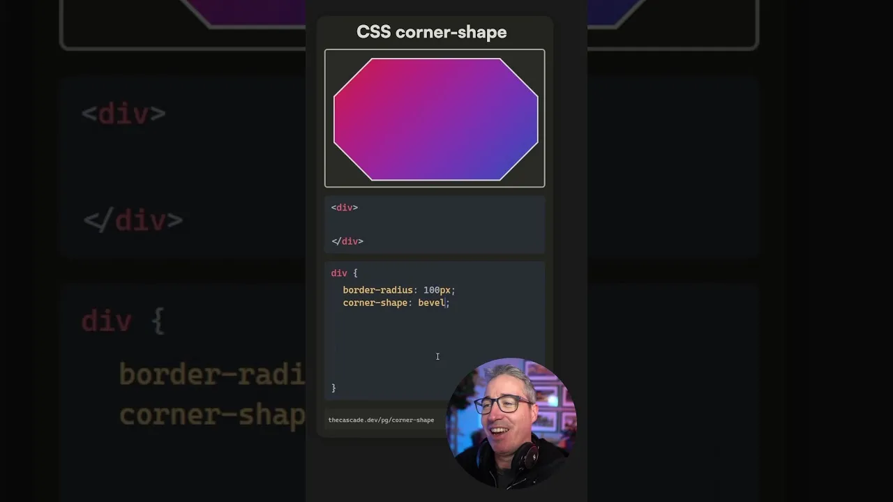
Step 5: Applying the `bevel` Shape
The bevel shape creates a chamfered or beveled edge, giving the corner a sliced-off look.
How to implement:
- Identify the target element.
- Use
border-radius: bevel;.
.element {
  border-radius: bevel;
}
This applies the bevel effect uniformly to all corners.
Step 6: Using `square` for Cut-out Effects
While square might seem counterintuitive for a property named border-radius, it can be used to create sharp, cut-out corners. You can apply it to specific corners for precise control.
How to implement:
- Select the element.
- Use
border-radius: square;to apply to all corners, or specify a single corner.
.element {
  /* Applies a square cut-out to all corners */
  border-radius: square;
}

.element-single-corner {
  /* Applies a square cut-out only to the top-left corner */
  border-top-left-radius: square;
}
Using square on a single corner can be a clean way to achieve a specific design without complex calculations.
Step 7: Understanding the `super-ellipse` Property
It’s important to know that scoop, squirle, notch, bevel, and square are all shorthand notations for the more powerful, albeit complex, super-ellipse property. The values you’ve seen (like scoop) correspond to specific mathematical parameters of the super-ellipse formula.
For instance, a negative value like -1 on the super-ellipse property can result in the scoop effect. Other values, like 1.5 or 2, might correspond to squirle or other predefined shapes. The exact mapping can be nuanced and depends on the browser’s implementation of the super-ellipse calculations.
/* Example illustrating the concept, not direct syntax */
.element {
  /* This is a conceptual representation */
  border-radius: super-ellipse(-1); /* Might result in scoop */
  border-radius: super-ellipse(2);  /* Might result in squirle */
}
While you can directly use the keywords for simplicity, understanding their origin in super-ellipse can be helpful for advanced customization or debugging.
Step 8: Considering Browser Support
Expert Note: As of the time of this writing, these advanced keyword values for border-radius might not have universal browser support. It’s crucial to check the latest Can I Use data for border-radius and its specific keyword values.
Tip: You can use these advanced shapes as a form of progressive enhancement. Provide a fallback with standard border-radius values (like pixel or percentage values) for browsers that don’t support the keywords. This ensures a baseline experience for all users while offering a more visually rich design for those with modern browsers.
.element {
  border-radius: 10px; /* Fallback for older browsers */
  border-radius: scoop; /* Advanced shape for modern browsers */
}
By layering the declarations, the browser will use the last one it understands. If it supports scoop, it will use that; otherwise, it will fall back to the standard 10px rounded corners.
Conclusion
The border-radius property offers more creative potential than commonly realized. By leveraging keywords like scoop, squirle, notch, bevel, and square, you can easily implement unique corner styles. Remember to consider browser support and implement fallbacks for a robust design. Experiment with these values to elevate your CSS styling!
Source: CSS just keeps getting better (YouTube)