Master CSS Shorthands for Efficient Styling
In modern web development, efficiency and readability are key. CSS shorthands offer a powerful way to write cleaner, more concise styles, saving you time and reducing the potential for errors. This guide will walk you through three essential CSS shorthands: `inset`, logical properties like `margin-block` and `padding-block`, and centering techniques using `place-items` and `place-content`.
What You’ll Learn
- How to use the `inset` property as a shorthand for `top`, `right`, `bottom`, and `left`.
- Understanding and applying logical properties for vertical and horizontal spacing.
- Efficiently centering elements using `place-items` and `place-content` with Grid.
Prerequisites
- Basic understanding of HTML and CSS.
- Familiarity with positioning properties like `position: absolute` and `position: fixed`.
- Knowledge of CSS Box Model (margins, padding).
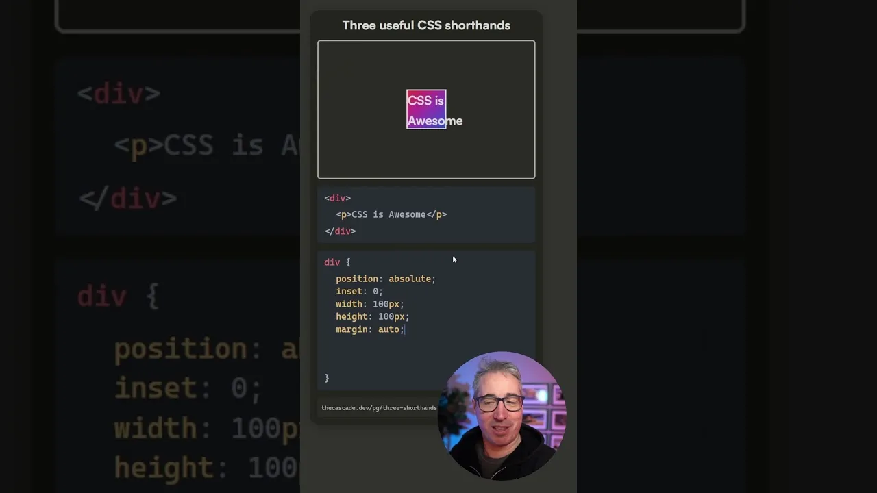
1. The `inset` Shorthand
The `inset` property is a convenient shorthand for setting the distance of an element from its container edges. It replaces the need to individually specify `top`, `right`, `bottom`, and `left` properties.
How it Works
- Basic Usage: When you need to set all four sides to the same value (e.g., `top: 0; right: 0; bottom: 0; left: 0;`), you can use `inset: 0;`. This will apply a value of 0 to all four properties.
- Multiple Values: Similar to `margin` and `padding`, `inset` can accept multiple values:
- One value: `inset: 50px;` applies 50px to all four sides (top, right, bottom, left).
- Two values: `inset: 50px 100px;` applies 50px to the top and bottom, and 100px to the left and right.
- Three values: `inset: 10px 20px 30px;` applies 10px to the top, 20px to the left and right, and 30px to the bottom.
- Four values: `inset: 10px 20px 30px 40px;` applies 10px to the top, 20px to the right, 30px to the bottom, and 40px to the left (clockwise).
- Using `auto`: While not a direct shorthand, you can use `auto` for specific sides if you don’t want to set a value, similar to how `auto` works with margins. For example, `inset: 0 auto;` would set top and bottom to 0, and left and right to auto.
When to Use `inset`
This shorthand is particularly useful when working with absolutely or fixed positioned elements where you need to precisely control their placement relative to their positioning context.
Example:
.element {
  position: absolute;
  inset: 0; /* Equivalent to top: 0; right: 0; bottom: 0; left: 0; */
}
2. Logical Properties: `*-block` and `*-inline`
Traditional CSS properties like `margin-top`, `padding-left`, etc., are physical properties, meaning they refer to specific directions on the screen. Logical properties, such as `margin-block`, `padding-block`, `margin-inline`, and `padding-inline`, are more flexible as they adapt to different writing modes.
Understanding Block and Inline Axes
- Block Axis: Refers to the top and bottom of the content.
- Inline Axis: Refers to the left and right of the content.
In most standard horizontal writing modes (like English), the block axis corresponds to the vertical direction, and the inline axis corresponds to the horizontal direction. However, if you were to switch to a vertical writing mode (e.g., `writing-mode: vertical-rl;`), these axes would swap accordingly.
How to Use Them
- `padding-block` and `margin-block`: These properties apply padding or margin to the top and bottom of an element (along the block axis). They are shorthands for `padding-top` and `padding-bottom`, or `margin-top` and `margin-bottom`, respectively.
- `padding-inline` and `margin-inline`: These properties apply padding or margin to the left and right of an element (along the inline axis). They are shorthands for `padding-left` and `padding-right`, or `margin-left` and `margin-right`, respectively.
Example:
.element {
  /* Applies 3rem padding to top and bottom */
  padding-block: 3rem;

  /* Applies 4rem margin to left and right */
  margin-inline: 4rem;
}
Expert Note: Using logical properties makes your layouts more robust and adaptable to internationalization and different display contexts.
3. Centering Elements with Grid
Centering elements is a common task in CSS. While various methods exist, CSS Grid offers powerful and concise shorthands for this purpose.
Using `place-items`
`place-items` is a shorthand for `align-items` and `justify-items`. When used on a grid container, it can center a single grid item within its cell.
- Apply `display: grid;` to the parent container.
- Use `place-items: center;` on the grid container. This will center the content both vertically (align-items) and horizontally (justify-items) within the grid area.
Example:
.container {
  display: grid;
  place-items: center;
  height: 300px; /* Example height */
}

.item {
  /* Content inside .item will be centered */
  width: 100px;
  height: 100px;
  background-color: lightblue;
}
Warning: `place-items: center;` centers a single item within its grid area. If you have multiple items and want to center the entire group of items within the container, `place-items` might not achieve the desired effect.
Using `place-content`
When you need to center the entire grid content (all items as a group) within the grid container, `place-content` is the property to use. It’s a shorthand for `align-content` and `justify-content`.
- Apply `display: grid;` to the parent container.
- Set a height and/or width on the container if needed to see the centering effect.
- Use `place-content: center;` on the grid container.
Example:
.container {
  display: grid;
  place-content: center; /* Centers the grid track(s) within the container */
  height: 300px;
  width: 300px;
}

.item {
  width: 100px;
  height: 100px;
  background-color: lightcoral;
}
Bonus: Centering on Block Elements (Experimental)
A more advanced technique, with less widespread browser support, allows centering on regular block elements using a combination of `justify-items` and `align-content` (or `place-content` and `place-items`).
- Give the block element a defined `height`.
- Apply `justify-items: center;` to center content horizontally within the element’s line boxes.
- Apply `align-content: center;` to center the content vertically within the element’s block axis. Alternatively, you can use `place-content: center;` and `place-items: center;` for a similar effect.
Example:
.container {
  height: 300px; /* Crucial for vertical centering */
  /* Using place properties for brevity */
  place-items: center;
  place-content: center;
  /* Fallback/alternative:
  justify-items: center;
  align-content: center;
  */
  background-color: lightgreen;
}

.item {
  width: 100px;
  height: 100px;
  background-color: lightyellow;
}
Browser Support Note: While `place-items` and `place-content` have good support for Grid layouts, the application on regular block elements might not be supported in all older browsers.
Conclusion
By incorporating these CSS shorthands – `inset`, logical properties like `*-block` and `*-inline`, and the powerful centering capabilities of `place-items` and `place-content` – you can significantly streamline your CSS, making your code cleaner, more readable, and more efficient.
Source: 3 essential shorthands (YouTube)