Mastering border-radius for Perfect Shapes
In web development, creating visually appealing shapes is crucial for good design. One common task is making elements perfectly circular using the `border-radius` CSS property.
While `border-radius: 50%` works for perfect circles, it can lead to awkward, elliptical shapes when applied to non-square elements. This tutorial will teach you a simple yet effective trick using viewport units to achieve consistent, desirable shapes like perfect pills and rounded corners, even with varying element dimensions.
Understanding the Problem with 50% border-radius
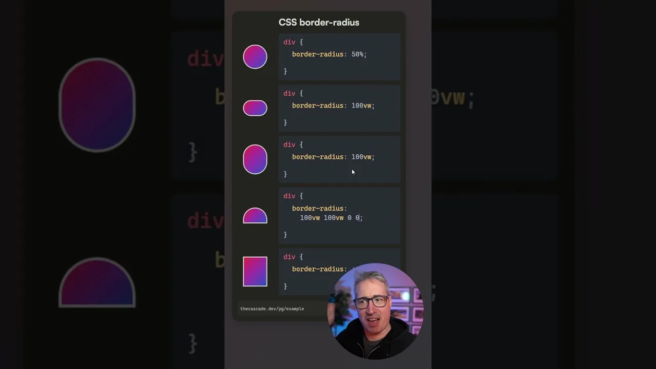
Typically, you might set `border-radius: 50%` to create a circle. This works flawlessly on elements with equal width and height. However, when applied to a rectangular element, `50%` of the width and `50%` of the height are applied independently to their respective corners.
This often results in an undesirable ellipse or an awkward oval shape that doesn’t align with the intended design. The goal is to achieve a consistent rounded effect, regardless of the element’s aspect ratio.
The Viewport Unit Solution
The key to overcoming the limitations of `border-radius: 50%` on non-square elements is to use viewport units, specifically `vw` (viewport width). Instead of a percentage that scales with the element’s own dimensions, viewport units scale relative to the browser window’s width. By applying a sufficiently large `vw` value to `border-radius`, you ensure that the rounding is so extensive it effectively creates a pill shape.
Step-by-Step Implementation
Apply a Large Viewport Unit Value for Pill Shapes
To create a perfect pill shape, apply a large viewport width value to the `border-radius` property. For example, if you want to round all corners to create a pill, you can set `border-radius` to a value like `100vw`.
Example CSS:
.element {
 width: 200px;
 height: 50px;
 border-radius: 100vw;
}
Explanation: By setting `border-radius` to `100vw`, you’re providing a value that is guaranteed to be larger than half the width of any element you’re likely to style this way. This forces the corners to round so much that they meet in the middle, creating a smooth, pill-like appearance. This method is robust because it doesn’t depend on the element’s actual width or height, only the viewport’s width, ensuring a consistent look across different screen sizes and element dimensions.
Achieve Half-Moon Shapes
You can also create half-moon shapes by strategically applying `border-radius` values. This involves setting different values for different corners, using the `border-radius` shorthand property which accepts up to four values (top-left, top-right, bottom-right, bottom-left).
Example CSS for a left half-moon:
.element {
 width: 200px;
 height: 100px;
 border-radius: 100vw 0 0 100vw;
}
Explanation: In this example, `100vw` is applied to the top-left and bottom-left corners, while `0` is applied to the top-right and bottom-right corners. This rounds only the left side of the element, creating a half-moon effect. You can experiment by changing the order and values to round different sides or create quarter-circle effects.
Create Cut-Off Corner Shapes
Another useful application is creating shapes with one or more rounded corners, akin to a cut-off corner. This is achieved by applying the large viewport unit value to specific corners.
Example CSS for a rounded top-right corner:
.element {
 width: 150px;
 height: 100px;
 border-radius: 0 100vw 0 0;
}
Explanation: Here, `100vw` is applied only to the top-right corner. The other corners are set to `0`.
This results in a shape where only the top-right corner is significantly rounded. This technique is versatile for creating unique UI elements or decorative effects.
-
Experiment with Different Corner Combinations
The `border-radius` property is highly flexible. You can combine `vw` units with `0` or other values to achieve a wide array of shapes. For instance, applying `100vw` to the last value in the shorthand targets the bottom-left corner.
Example CSS for a rounded bottom-left corner:
.element {
 width: 150px;
 height: 100px;
 border-radius: 0 0 0 100vw;
}
Explanation: This rounds only the bottom-left corner. By understanding the order of values in the `border-radius` shorthand (top-left, top-right, bottom-right, bottom-left), you can precisely control which corners are rounded and to what extent, using `100vw` to ensure a significant rounding effect.
Tips and Considerations
Consistency is Key
Using `100vw` (or a similarly large `vw` value) ensures that the rounding is always applied as extensively as possible, preventing the awkward oval shapes that `50%` can produce on non-square elements.
Viewport Unit Caveats
While viewport units are powerful for this specific `border-radius` trick, be mindful of their general usage. `vw` and `vh` units scale with the viewport, which can sometimes lead to unintended consequences on very small or very large screens if not handled carefully. However, for `border-radius`, their behavior is predictable and beneficial.
Alternative Values
While `100vw` is a common and effective value, you can experiment with other large `vw` values (e.g., `50vw`, `200vw`) depending on the specific design requirements. The key is that the value should be large enough to ensure the rounding covers half the element's dimension.
Browser Support
`border-radius` and viewport units (`vw`) have excellent browser support across all modern browsers.
Conclusion
The `border-radius` trick using viewport units is a simple yet powerful technique for web designers and developers. It allows for the creation of perfect pill shapes, half-moons, and other rounded corner effects consistently, regardless of the element's dimensions. By moving away from the often-unpredictable `50%` on non-square elements and embracing large `vw` values, you can achieve cleaner, more professional-looking designs with ease.
Source: border-radius trick (YouTube)