How to Build a Stylish UI in 10 Minutes With CSS
Ever wanted to quickly transform plain HTML into a visually appealing design? This guide will show you how to use CSS to style a complex UI layout within a tight deadline. You’ll learn to manage your time effectively, plan your approach, and apply various CSS techniques to achieve a polished look.
What You’ll Learn
This tutorial will guide you through the process of styling a pre-made HTML structure using CSS. You will learn how to:
- Analyze existing HTML and CSS to create a strategy.
- Use Flexbox and Grid for layout and spacing.
- Apply colors, borders, and padding effectively.
- Style different sections like headers, rows, and footers.
- Make quick adjustments to match a target design under time pressure.
Prerequisites
- Basic understanding of HTML structure.
- Familiarity with CSS properties like display, flex, gap, color, padding, border, and font.
- Access to a code editor and browser to see changes.
Steps to Style Your UI
Plan Your Attack
Before the timer starts, carefully examine the provided HTML and CSS. Understand what each part of the design represents, like the header, score rows, and footer. Look at the target design to see how elements are spaced and colored. Having a clear plan helps you work faster.
Style the Main Board Container
Start by styling the main container for your UI. Use
display: flexwithflex-direction: column. This will stack your main sections vertically. Set a smallgap, like0.5rem, to create some space between these stacked elements. This sets up the basic structure for the entire page.Design the Header Section
The header often contains titles or icons. Make it a flex container using
display: flexand add agapfor spacing between items. Apply a background color using your provided CSS variables, such asbackground-board. Add padding around the content, maybe1rem, and a slightborder-radius, like5px. Set a fixed width, perhaps420px, and add a border using an accent color likeborder: 1px solid var(--border-main). Ensure items are centered vertically withalign-items: centerand horizontally withjustify-content: center.Expert Tip: If text appears too close or too far apart, adjust
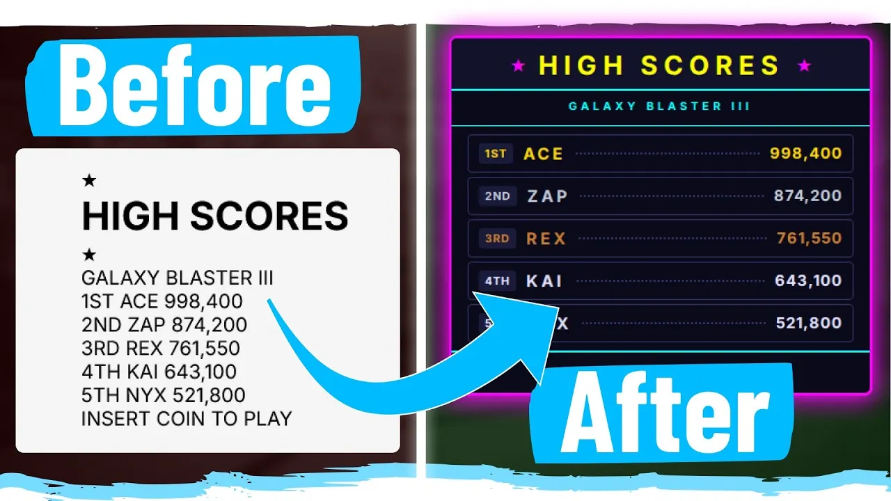
letter-spacing. For the header, a value around6pxor7pxmight work well to match the design.Style the Score Rows
Each score row needs to display information clearly. Set the row to use
display: flexwith a smallgap, like10px. Inside each row, elements like the badge and score details should align nicely. Usealign-items: centerto ensure everything is vertically aligned.For the dotted line effect, target the element that should contain it (e.g.,
.score-dots) and apply aborder-bottom: 2px dotted var(--color-dots). This creates a visual separator that grows to fill the available space.Style Individual Score Elements
Apply specific styles to the badge, player name, and score. Give the badge a background color (e.g.,
var(--color-badge-background)) and some padding (e.g.,5px). For the text elements (player name, score), set appropriate colors using your variables (e.g.,var(--color-gold),var(--color-silver),var(--color-bronze),var(--color-normal)). You might also need to adjustfont-sizeandfont-weight, perhaps making names and scores bold.Warning: Sometimes, font weights or sizes might not match exactly. Look at the overall visual impact and choose a setting that looks best, even if it’s not pixel-perfect. Adjusting
letter-spacingon these elements can also help refine the look.Style the Subtitle Section (Galaxy Blaster)
This section likely needs a top and bottom border. Use
display: flexandjustify-content: centerto center the text. Apply the correct text color usingvar(--color-subtitle). Add borders using1px solid var(--border-inner)on the top and bottom. Adjust padding, perhaps8pxor9pxon top and0pxon the bottom, to get the spacing just right. Setting thefont-weightto bold and adjustingfont-sizeandletter-spacingwill complete the look.Note: If the section doesn’t fill the full width as expected, you might need to adjust its container or use negative margins to pull it into place. A small gap of
0.25remto0.5remon the main container can help with overall spacing.Style the Footer
The footer is often similar to other sections. Center its text and apply a background color using
var(--color-footer). Add a top border using1px solid var(--border-inner). Adjust thefont-sizeandletter-spacingto match the design. Ensure it has appropriate padding, which might only be needed on the top, like1rem.Refine and Adjust
As time runs out, focus on the biggest visual differences. Check the overall height, spacing between elements, and text sizes. Look at the ‘diff view’ or overlay to compare your work with the target. Small tweaks to padding, margins, gaps, and font sizes can make a big difference. For instance, adjusting the
gapfor the stars in the header or the padding on the subtitle can bring your design closer to the goal.Expert Tip: Don’t get stuck on tiny details if time is short. Prioritize the main layout and key visual elements. Achieving 70-80% accuracy in 10 minutes is a great success. AI tools might offer a starting point, but manual adjustments are often needed for precise results.
Source: Can I Build This UI In 10 Minutes (YouTube)