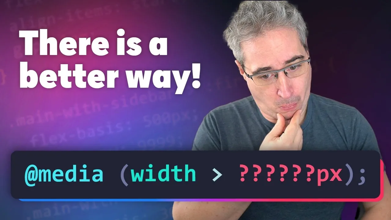
Stop Using Magic Numbers for Breakpoints
This article will show you how to move away from guessing numbers for your website’s breakpoints. You’ll learn to use container queries and content-based units like ‘ch’ to create more flexible and responsive designs. By the end, you’ll understand how to make your layouts adapt automatically to the content, rather than relying on fixed pixel or rem values.
What You’ll Learn
- Why traditional media query breakpoints can be problematic.
- How to set up and use container queries.
- The benefits of using the ‘ch’ unit for breakpoints.
- How to create breakpoints that adapt to your content.
Prerequisites
Basic understanding of HTML and CSS. Familiarity with concepts like responsive design and breakpoints is helpful, but not strictly required.
Why Magic Numbers Don’t Work
Many developers use fixed numbers, like 768 pixels or 50 rem, to decide when a website’s layout should change on different screen sizes. These are often called “magic numbers” because they are chosen without a clear reason related to the content itself.
Using media queries with these fixed numbers means the breakpoint is set in the global scope. This can cause problems because the media query can’t see what’s happening inside specific elements, potentially breaking your layout.
For example, if you set a breakpoint based on a font size and then change the base font size of your whole site, the breakpoint might no longer work correctly. This can lead to elements overlapping or content becoming unreadable, especially if the font size changes significantly. It’s like setting a rule for a room based on the weather outside, but not checking if the room itself is too hot or too cold.
Introducing Container Queries
Container queries offer a better way to handle responsive design. Unlike media queries, which check the entire viewport size, container queries check the size of a specific parent element, called a container. This means your styles can adapt based on the actual space available within that element, not just the overall screen size.
To use container queries, you first need to tell the browser which element should act as a container. You do this by adding a `container-type` property to the HTML element you want to monitor.
For instance, you can set `container-type: inline-size;` on a `main` element. This tells the browser to track the width of that `main` element and use it for its queries.
Moving Beyond Magic Numbers with ‘ch’
Even with container queries, you might still be tempted to use fixed units like `rem` for your breakpoints. This is still a form of a magic number. A more effective approach is to use units that relate directly to the content itself, such as the `ch` unit.
The `ch` unit is based on the width of the character ‘0’ in the current font. It’s a content-first unit because it measures space in terms of how many characters can fit. For example, setting a breakpoint at `90ch` means the layout will adjust when the container is approximately 90 characters wide.
This is a smarter breakpoint because it relates to readability. Most text looks best when lines are between 25 to 30 characters long.
By setting a breakpoint at `90ch`, you’re essentially saying the layout should change when each column within the container is getting too narrow, around 30 characters wide, plus any padding. This ensures your text remains readable across different screen sizes.
How to Implement Content-First Breakpoints
Here’s how you can apply this concept:
- Identify your container element: Choose the HTML element whose size should determine the layout changes. This could be a `main` tag, an `article`, or any other relevant wrapper.
- Define the container: Add `container-type: inline-size;` to the CSS for your chosen element. This makes it a responsive container.
- Set the container query: Instead of using a media query like `@media (min-width: 50rem)`, use a container query like `@container (min-width: 90ch)`. Replace `90ch` with a value that makes sense for your content’s readability goals.
- Adjust styles within the query: Inside the `@container` block, apply the CSS changes needed for when the container reaches that specific width. This could involve changing column layouts, font sizes, or element spacing.
If you change your project’s base font size, the `ch` unit will automatically adjust. The breakpoint will move because the `ch` unit is tied to the current font size. This means your breakpoints adapt gracefully, maintaining good text readability without you needing to manually update magic numbers.
Benefits of This Approach
Using content-first breakpoints with container queries offers significant advantages. You are no longer guessing numbers from frameworks like Tailwind or Bootstrap; instead, you make informed decisions based on how your content actually looks. This leads to more robust and truly responsive designs that feel natural on any device.
This method is one of the most effective ways to use container queries today. It ensures that your layout adapts based on the content’s needs, creating a better user experience. You can also explore other features like wrap detection, which detects when content wraps within a container due to intrinsic breakpoints.
If you want to learn more about container queries, including their limitations and advanced patterns, consider exploring courses dedicated to CSS. Resources that cover the basics, potential pitfalls, and best practices can help you master these powerful tools.
Start experimenting with `ch` units and container queries in your next project. Your designs will thank you for it.
Source: No more magic numbers for your breakpoints (YouTube)