How to Style Input Fields With Two CSS One-Liners
You can make your website look more professional with small design details. One easy way to do this is by changing the color and shape of your input fields.
These are the boxes where users type information, like in a search bar or a sign-up form. By using just two simple CSS commands, you can quickly update the look of these elements to match your site’s branding.
In this guide, you’ll learn how to change the color that appears when a user clicks into an input field. You’ll also discover how to alter the shape of the input field itself, giving you more control over the design. These changes are easy to make and can make a big difference in how your website feels to users.
Prerequisites
To follow along with this guide, you should have a basic understanding of HTML and CSS. You’ll need access to your website’s HTML file and its CSS stylesheet.
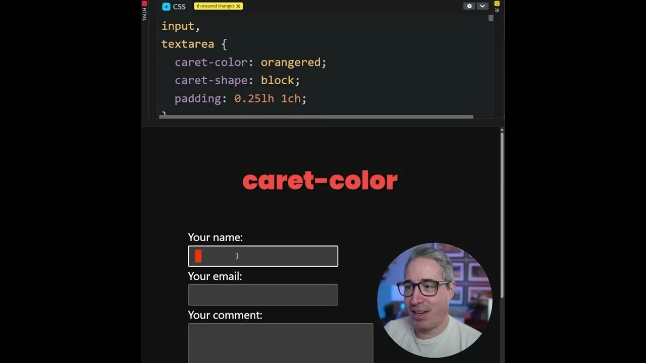
Step 1: Change the Input Field Accent Color
The first CSS trick lets you change the color that highlights an input field when a user clicks on it. This is called the accent color. For example, if your website uses a specific brand color, you can apply it here.
To do this, you will add a CSS rule targeting the input elements. You’ll use the ::webkit-input-placeholder pseudo-element for this. This targets the placeholder text, but we’ll use it to set the accent color for the input box itself.
Let’s say you want to use a nice orange-red color. You would add the following line to your CSS file:
Input::webkit-input-placeholder { color: orangeRed; }After adding this code, when a user clicks into any input box on your page, you will see the orange-red color appear. This provides a subtle visual cue that matches your site’s design. It’s a small detail that can make your site feel more polished and professional.
Expert Note on Browser Support
The ::webkit-input-placeholder pseudo-element is primarily supported in WebKit-based browsers like Chrome and Safari. This means the accent color change might not appear in all web browsers.
It’s a good idea to check browser compatibility if you need consistent styling across all platforms. Consider this a progressive enhancement – a nice extra if the browser supports it.
Step 2: Change the Input Field Shape
The second CSS one-liner allows you to change the shape of the input field itself. The default shape is usually a simple rectangle.
However, CSS offers different styles for how the input box can be presented. This can be useful for creating specific visual effects, like mimicking older input styles or creating unique designs.
You can use the appearance CSS property to change the shape. This property controls the visual style of user interface elements. Here are a few options you can try:
Option A: The Default Shape
The default value for appearance is none or auto, depending on the element and browser. If you set appearance: none;, the browser will use its default styling. You likely won’t see a change if you use this option, as it reverts to the standard look.
Option B: The ‘Square’ Shape (Rectangle)
While named ‘square’, this setting often results in a rectangular box. It’s a common style for input fields. To apply this, you would add:
Input { appearance: square; }This style provides a clean, standard rectangular input field. It’s a safe choice if you want a consistent look across different browsers.
Option C: The ‘Block’ Shape
The block value gives you an older, more classic input style. This might look like a solid block or a thicker border around the input area. You can apply it with this code:
Input { appearance: block; }This style can be effective if you are creating a fake text editor or want a retro feel for certain parts of your website. It adds a distinct visual character.
Option D: The ‘Underscore’ Shape
The underscore option is quite unique. It shows a simple line or underscore at the beginning of the input field. You can use it like this:
Input { appearance: underscore; }One interesting behavior with the underscore style is that it might only appear once you start typing. When the input field is empty, you might not see the underscore.
As soon as you type something, the underscore becomes visible. This is a peculiar quirk to be aware of when using this option.Important Considerations for Input Shapes
Browser support for the
appearanceproperty can vary. While it's widely supported for basic shapes, more experimental values likeblockorunderscoremight not work consistently everywhere.Always test your designs across different browsers and devices. You might need to provide fallback styles using standard CSS properties if a specific
appearancevalue doesn't work as expected.By combining the accent color and the shape adjustments, you can significantly enhance the user experience on your website. These simple CSS additions offer a powerful way to customize your forms and input fields. Start experimenting with these one-liners today to give your site a fresh, branded look.
Source: Two CSS one-liners (YouTube)